Project Description
Chinese is the second most consumed cuisine in India, right after Indian. Though immensely popular with people between the ages of 18 to 35, in the midst of their time poor & stressed out lives, they don’t really have those many reasonable options. When it comes to Chinese food, there are mostly just two choices in India. Either, at one extreme, cheap street vendors or, at the other, premium fine dine restaurants, with not much else in the middle.
Discovering this clear gap, Jubilant Food Works; after successfully bringing Domino’s and Dunkin’ Donut to India, decided to start their first independent F&B venture to solve this problem.
FITCH was approached to develop a new restaurant concept that would capitalise on the space existing in the mid-market. The brief was simple - to create a refreshingly new, bold and contemporary take on Chinese dining that millennials would find unintimidating and inviting. A space where they could celebrate every small occasion, turning dining out into a joyous moment.
Agency Solution
While, the overall space had to clearly call out the type of cuisine, we wanted a fresh new interpretation that did not have to rely on tired ‘Chinese’ clichés like the colours gold, bright red and black and icons like dragons that are so over used in Chinese restaurants across India . Based on the central idea of ‘Progressive Familiarity’, we decided to capture the essence and magic of an Asian street. An authentic, yet unexplored interpretation of the ‘real Asia’.
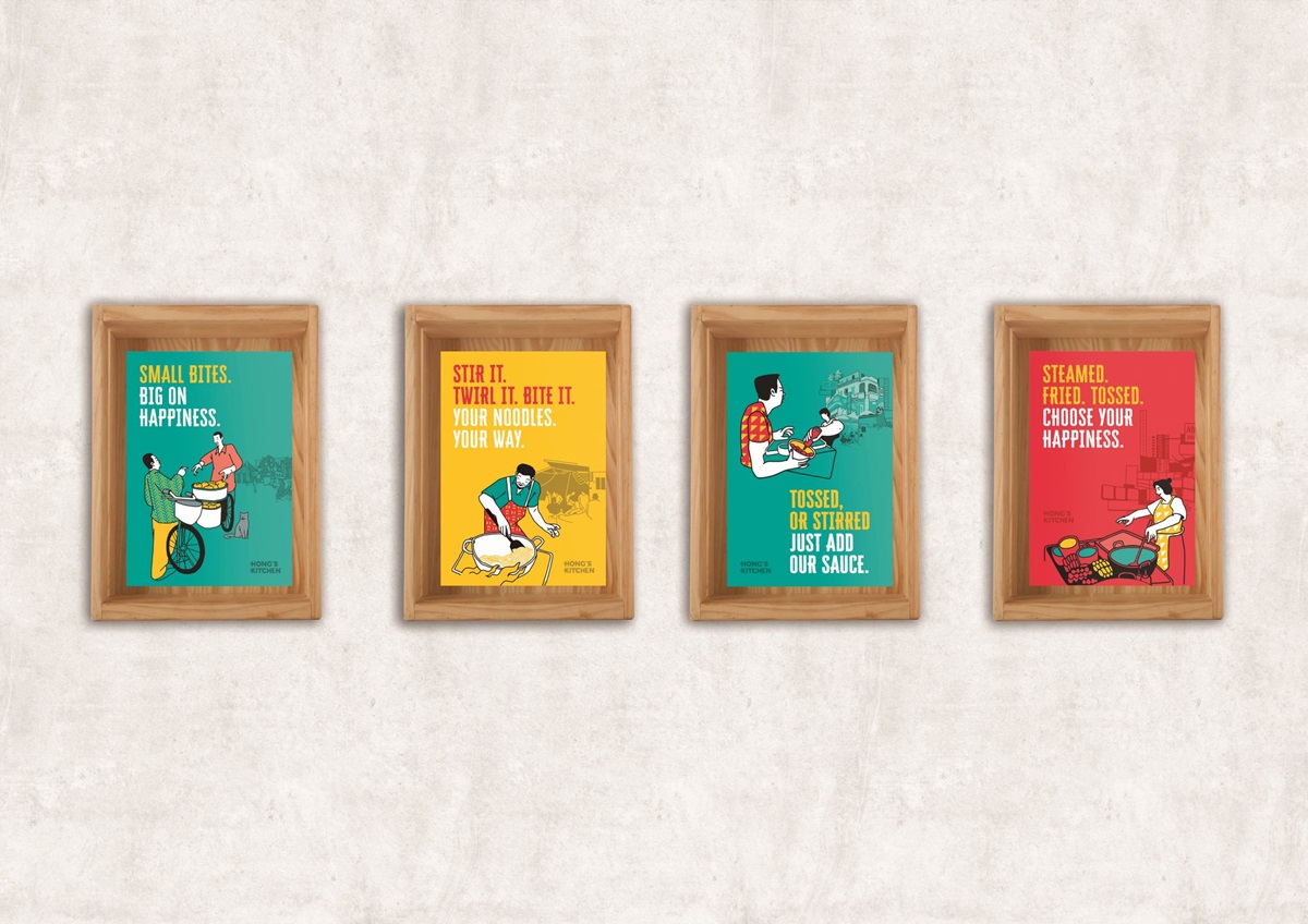
Our posters clearly reflect this ideal.
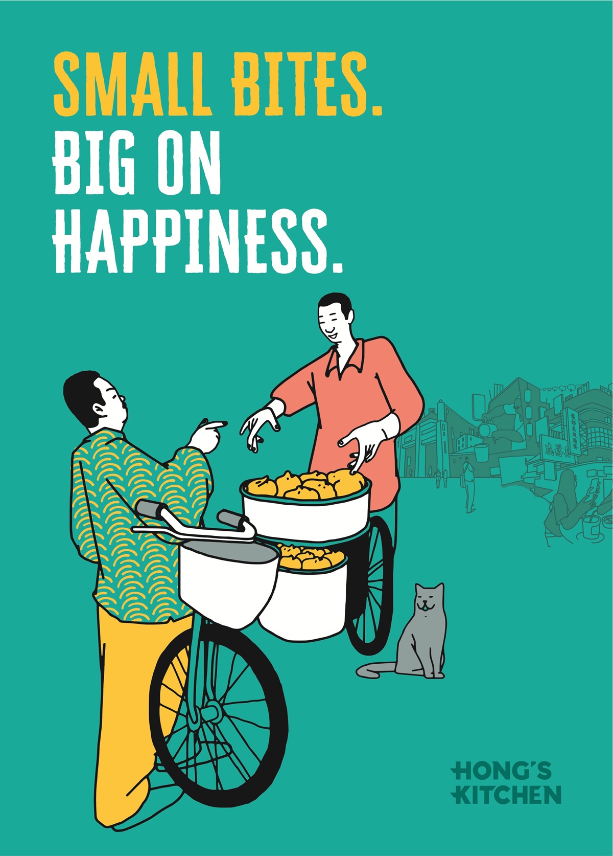
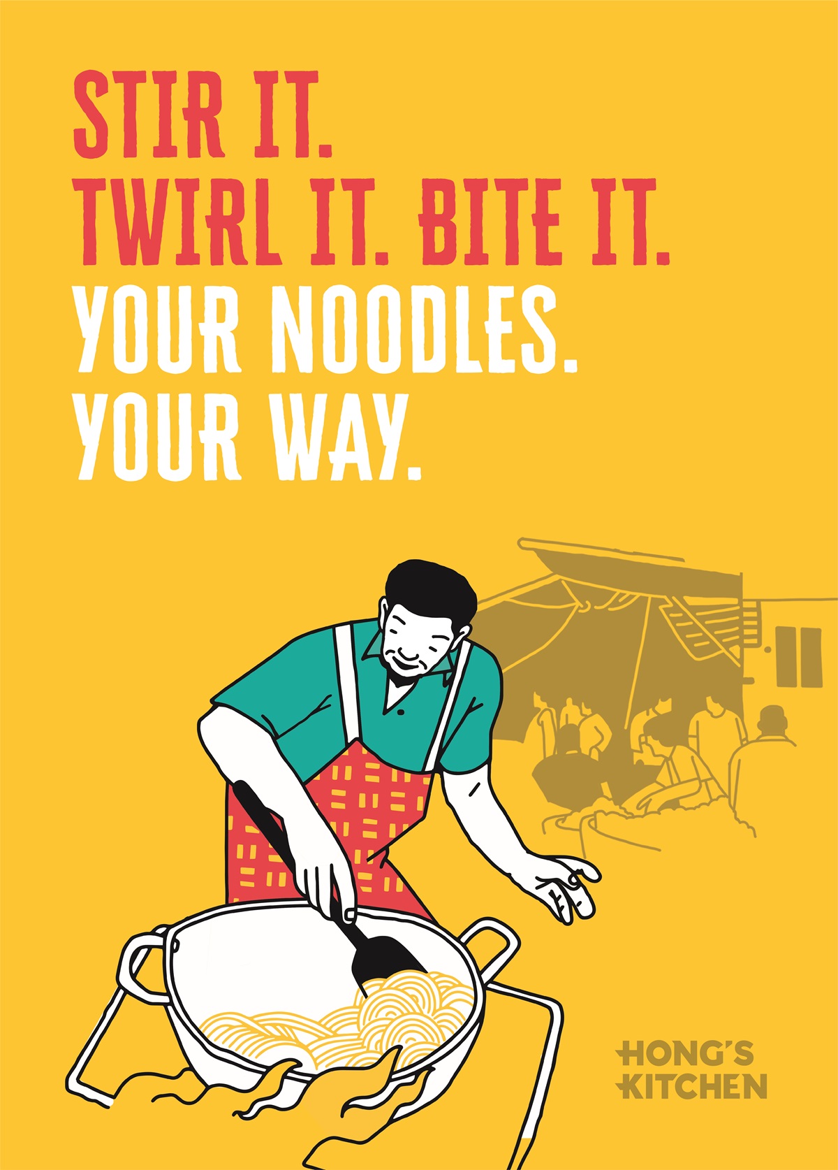
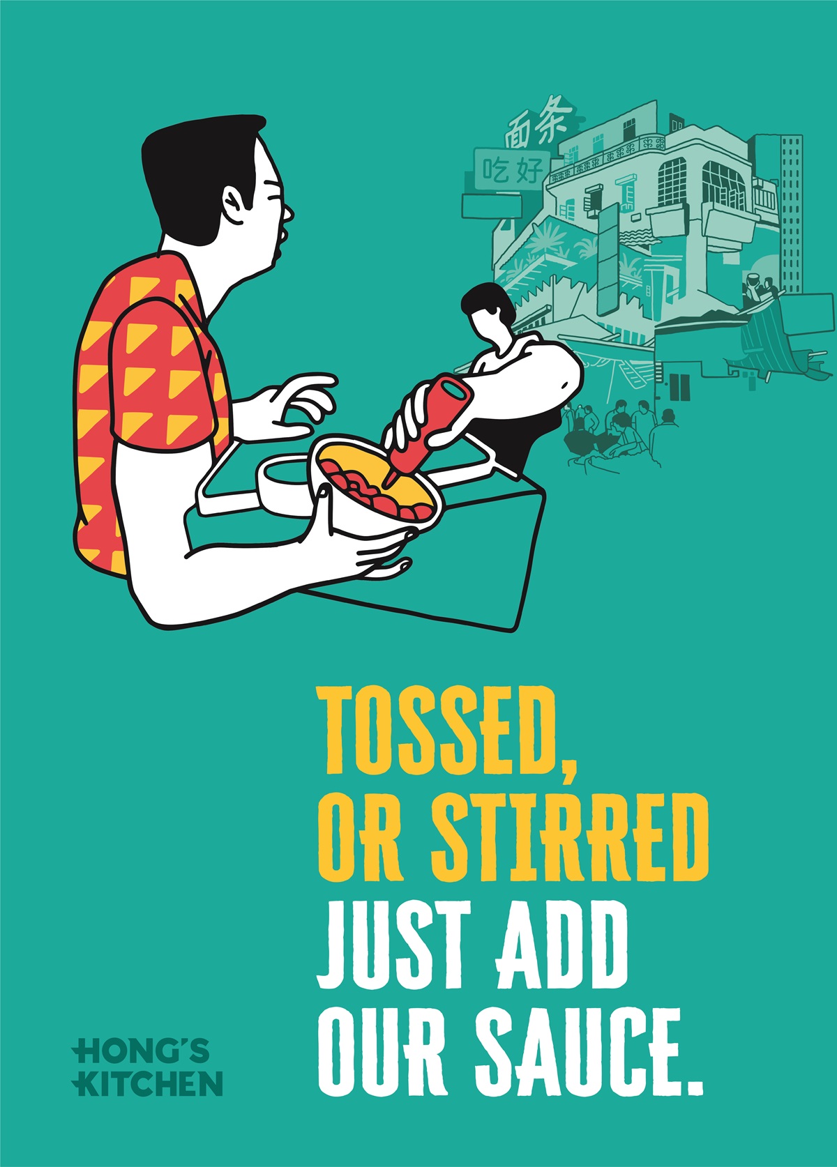
The background uses the three eye catching brand colours - teal, canary yellow and Persian red. These are fresh colours that have never been used in this setting in India and establish the visual tone of approachable vibrancy that is found in Asian streets and in Hong’s Kitchen.
On the colour base are sections from the key brand illustration that graphically bring to life the organised chaos and theatre of food being prepared in street stalls, working as the perfect visual metaphor for the live cooking kitchen present in the restaurant.
The tone of voice of the poster copy is light-hearted and casual, explaining the process behind the cooking and directions of eating in a simple, easy to understand manner supported by relevant elements from the illustration.
While posters usually get printed on cheap vynl or paper, ours have been specifically printed on canvas to make it look hand painted and textured. This not only adds character to the poster but also brings out the richness in our work.
With this use of vibrant colours, modern illustration style and friendly tone of voice, we’ve perfectly fused a traditional setting with a contemporary treatment, vividly captured the vibrancy of life and moments of joys.