Project Description
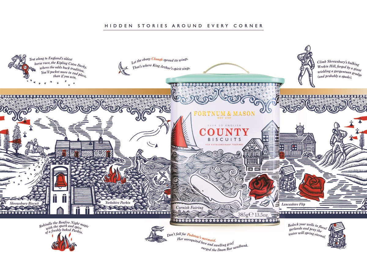
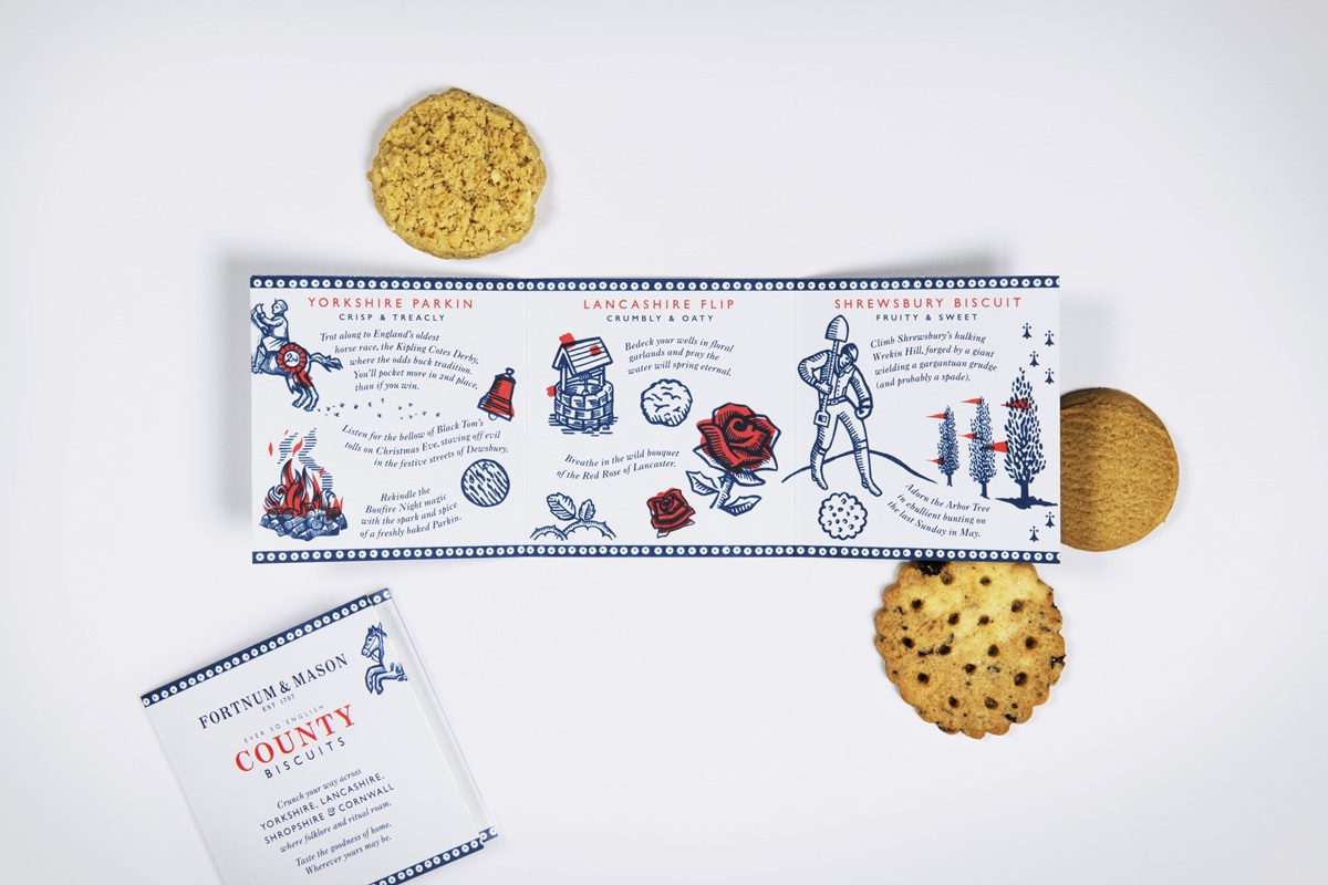
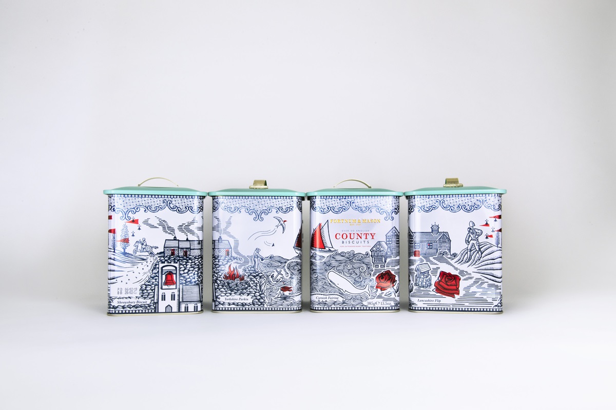
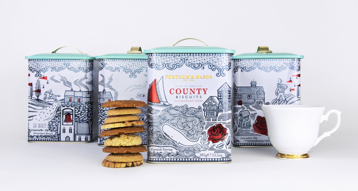
Inspired by ancient English County folklore & quirky traditions rooted in the recipes of the biscuits, and of the Counties themselves, our Fortnum & Mason 'Ever so English' Biscuit tin is a celebration of all the eccentricities of our 4 Counties brought to life with traditional woodcut style illustration.
Agency Solution
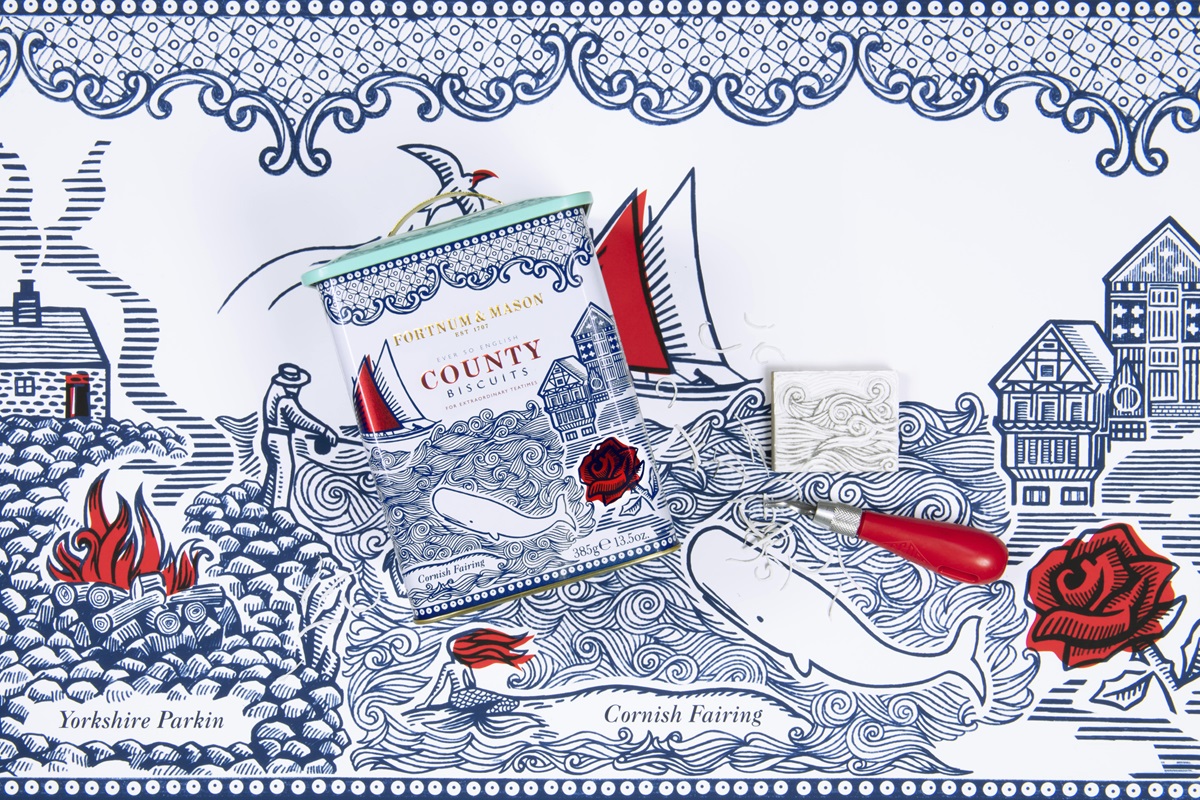
We delved into the unique and quirky folklore specific to each of our counties, and biscuit recipe history to be inspired by true legendary stories, which in turn shaped the brief.
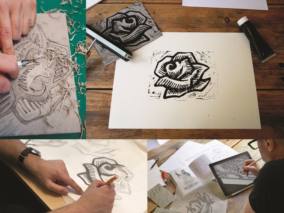
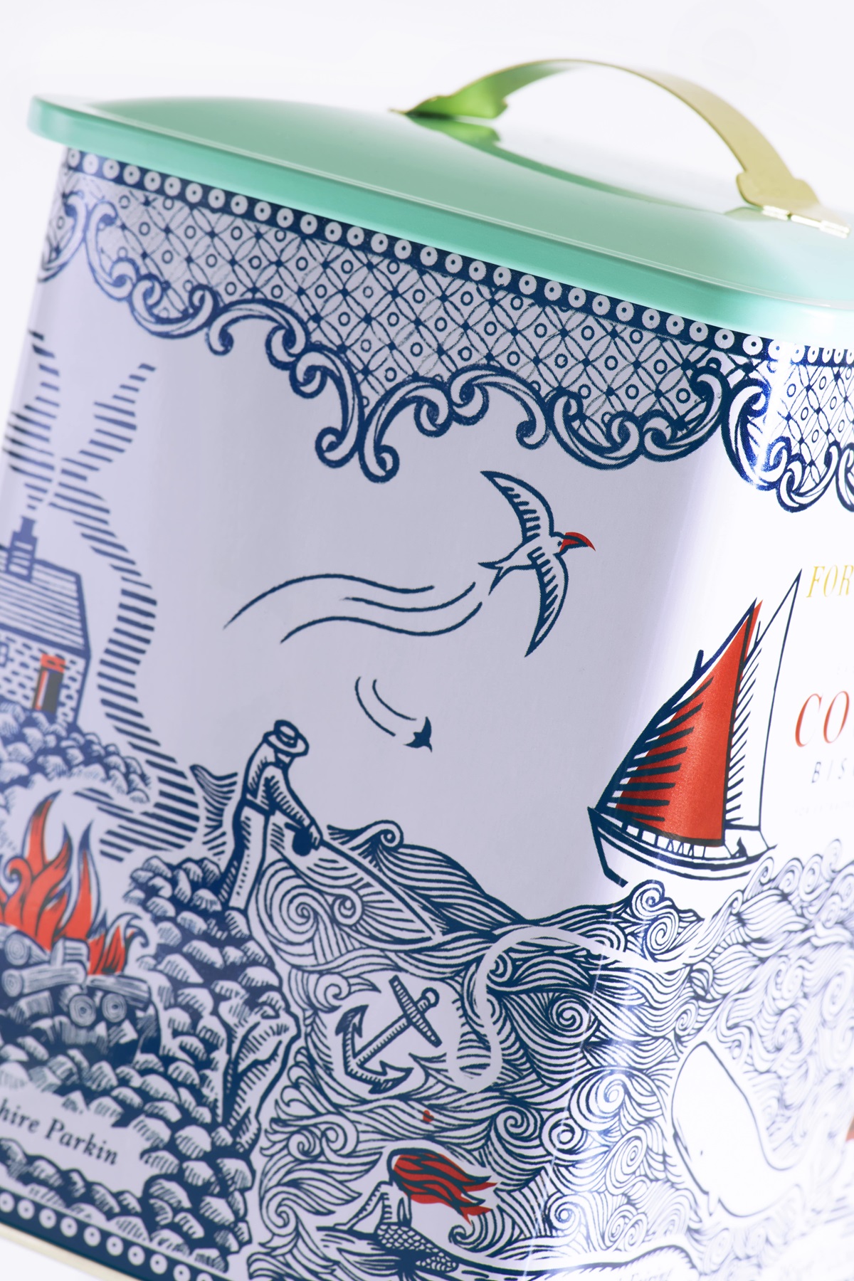
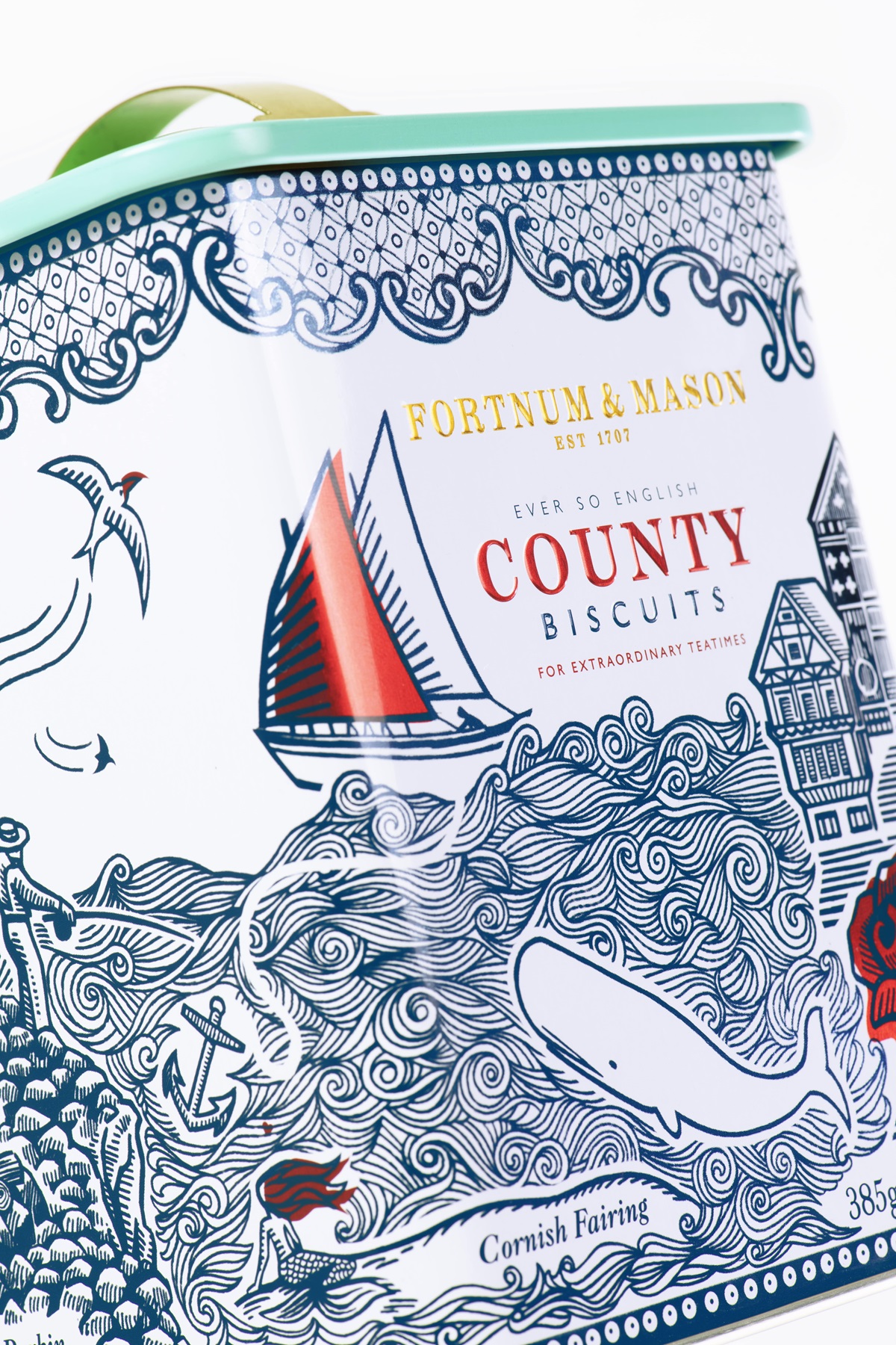
Bringing these folk tales to life around the tin through the beautiful and traditional method of wood cut inspired illustrations, which weaved together to make a fantastical tapestry that not only reflects the landscape of each of the individual counties (through housing style, geographic references and known landmarks), but also has hidden stories and details that would be familiar tales told through generations. The tin itself had to be keep-able enough for people to use it as 'their biscuit tin' once all the Fortnum & Mason biscuits had been devoured... hence the stripped back colour palette and layers of rewards to discover over time.