Project Description
The Urban Justice Center is a non profit social justice accelerator that began out of a burned-out building in East Harlem with almost no funding. They arrived at soup kitchens, jails and shelters—places others would not go—to set up free legal clinics to help the most vulnerable in society. They needed their brand to be more accessible, engaging, and inspiring – all in service of driving name recognition and fundraising. They need to be known as the guiding force for social justice.
Agency Solution
Creative Idea:
Urban Justice Center needs to inspire audiences to become advocates – whether through monetary donations or as a Project joining the accelerator.
The Execution:
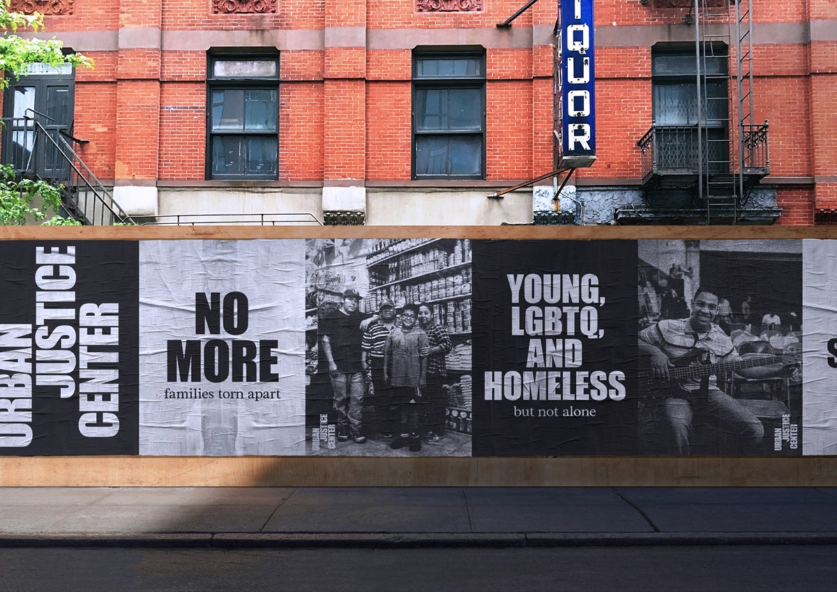
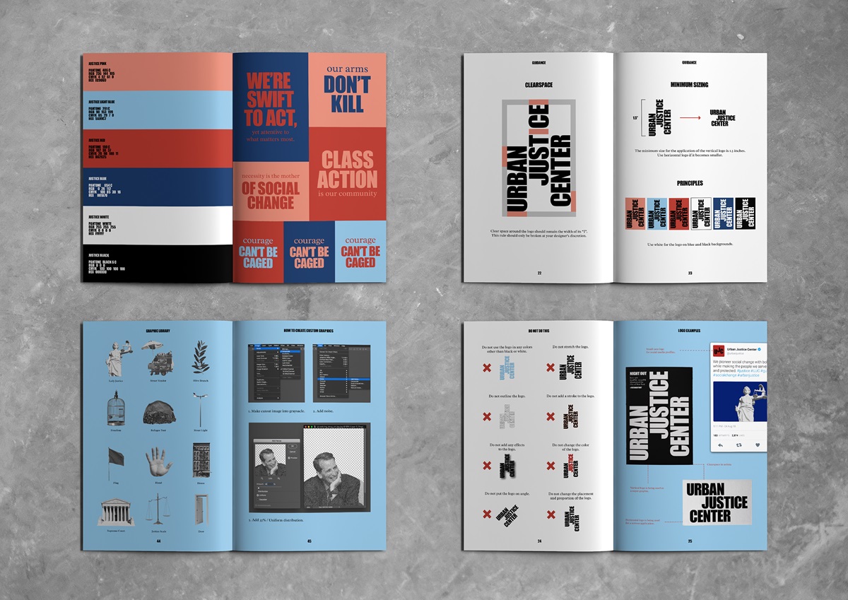
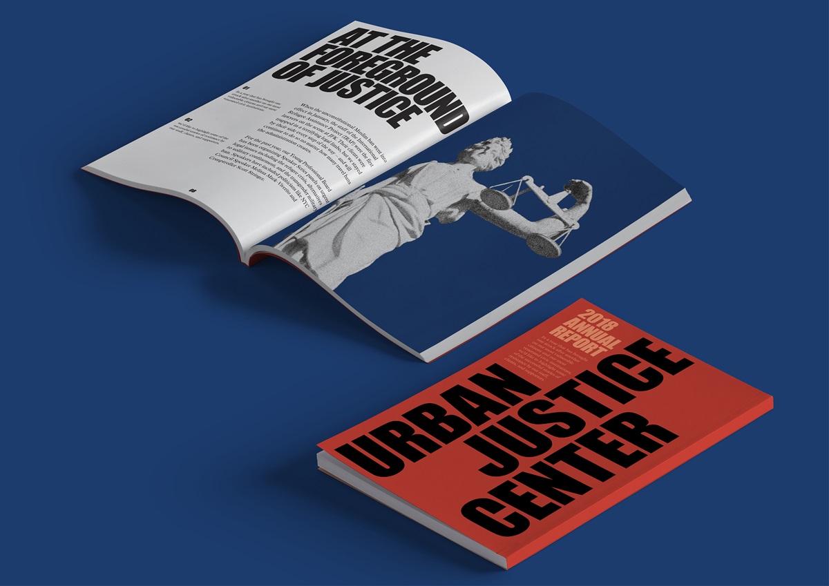
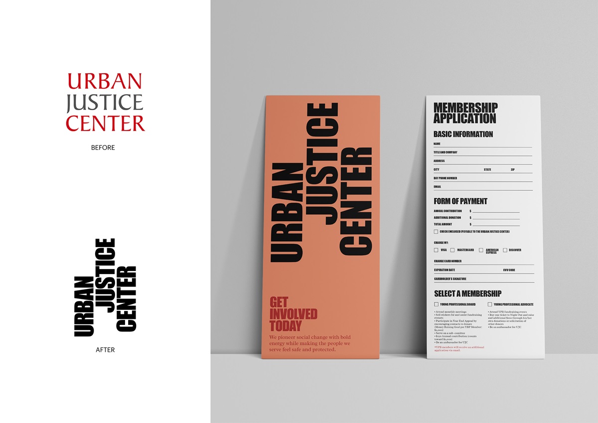
Driven by the gritty, grassroots methodology of the Urban Justice Center, the identity is inspired by in-your-face protest posters. The logo itself is black and white because in justice there is only right and wrong. It’s as simple as black and white. The typefaces are Impact and Radley, which are available and free for everyone as justice should be for everyone. Using bold and impactful typography and illustration elements to position The Urban Justice Center as the guiding force for social justice.