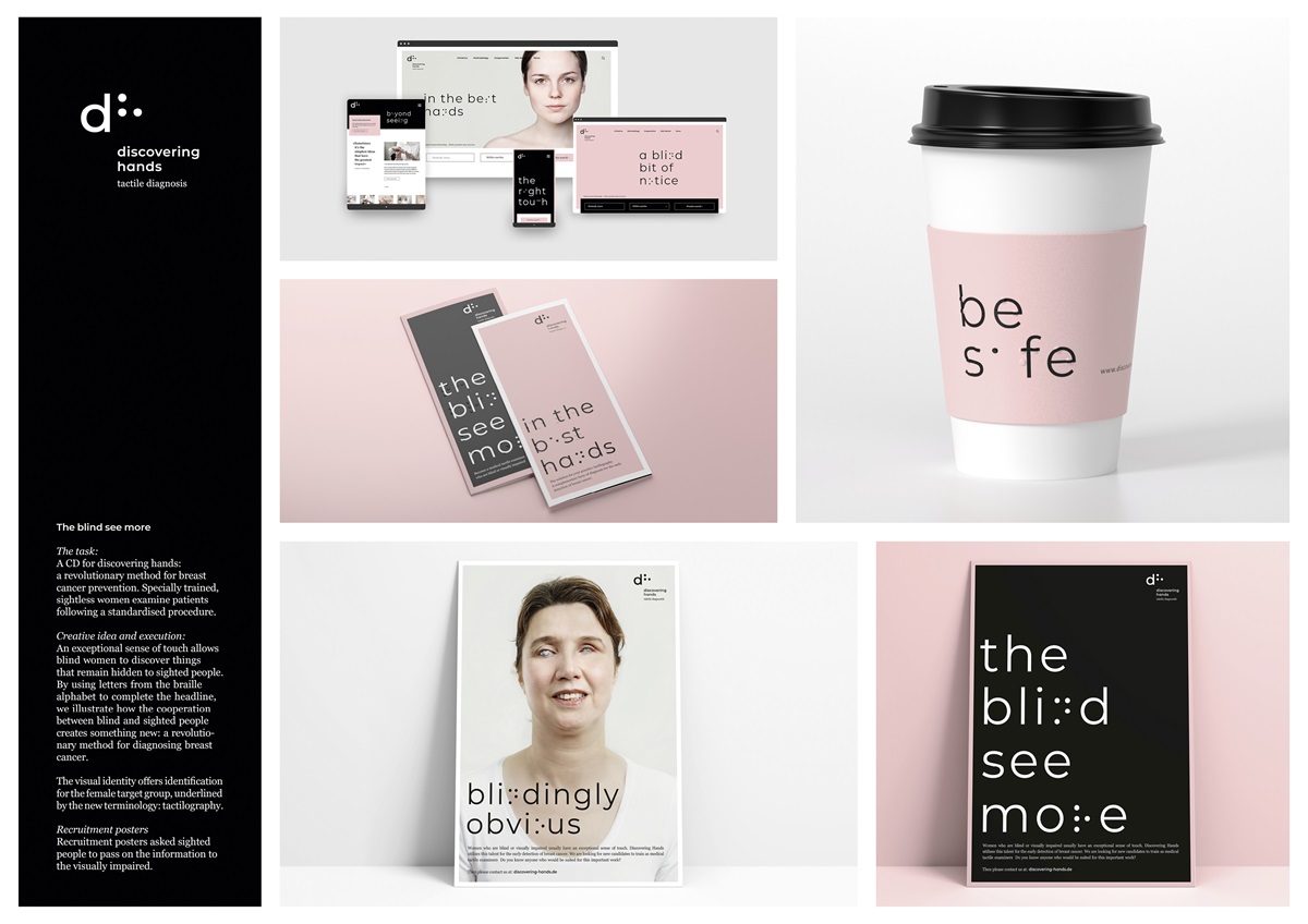
The blind see more
By KW43 Brand Design - Dusseldorf
For discovering hands Brand discovering hands (Early breast cancer detection)
Highly Commended in category Design & Branding
In subcategory Identity and Branding - Identity Design Small 10s

Project Description
Task:
To develop a corporate design for discovering hands.
Background:
One out of eight women in Germany develops breast cancer. 70.000 are diagnosed, yet for 18.000 it is fatal. An early diagnosis can save life. discovering hands has closed a critical gap in cancer screening with a new technique of tactile breast examination.
This method is remarkable: specially trained blind women examine the patients following a standardised and scientifically grounded procedure. Because these women have an exceptional sense of touch, they are able to detect the smallest of tumours at an early stage.
Together with the doctor, a reliable diagnosis is made, ensuring therapy at the earliest possible stage.
Budget:
Pro bono social project
Project scope and volume: (15 words)
Strategy, corporate design, logo, nomenclature, business stationary, various advertising media from adverts to posters, website
Agency Solution
Creative idea:
“The blind see more”: An exceptional sense of touch allows blind women to discover things that remain hidden to sighted people. This guiding idea is translated in an expressive and visually dominating typographic concept.
Brand relevance:
In Germany health insurance does not cover the costs of mammographies for women under 50. Therefore, the method offered by discovering hands plays a vital role in closing this gap.
Target group:
Women of all age groups requiring a breast cancer screening
Doctors
Blind women as potential tactile examiners (recruitment) Execution:
We show how an exceptional sense of touch allows blind women to discover things that remain hidden to sighted people. Using letters from the braille alphabet to complete the typography in the headline, we illustrate how blind and sighted people work together. This unconventional collaboration creates a revolutionary, diagnostic method to fight against breast cancer.
The visual identity addresses the target group with great sensitivity, awakening trust in the method. The trained blind women are depicted authentically, expressing their new self-confidence. The new terminology, tactilography underlines the medical tonality and complements standard examination methods, mammography and sonography.
Recruitment posters: (16 words)
The posters are unusual in targeting sighted people from the circle of acquaintances of the blind.
Design touchpoints: (15 words)
Print and digital media, doctors’ surgeries, hospitals and schools and trade fairs for the blind
Goal: (21 words)
discovering hands has entered the fight against breast cancer. That’s why it’s important to make this revolutionary diagnostic method universally known.
Scale: (1 word)
360-degree