Project Description
Few countries have a higher density of ATMs as does Holland. But as Dutch society continues to go digital, banks and their High Street ATM services are becoming increasingly obsolete. In 2018 Holland’s three largest banks – ABN Amro, ING and Rabobank – joined forces to launch a single ATM service for everyone, everywhere.
Backed by 20 years of experience with international banks, insurance companies and multinationals, our agency won this prestigious pitch for what is arguably the most visible Dutch branding project in the past decade. An initiative by Holland’s three largest banks – ABN Amro, ING and Rabobank – the brief called for an accessible and user-friendly ATM brand name and visual identity capable of replacing all other ATMs in the Netherlands by 2021.
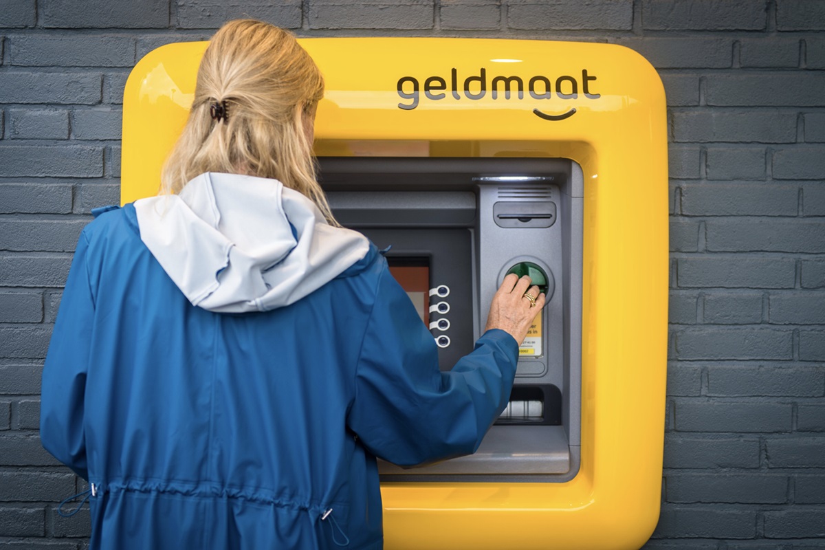
Our strategy looked beyond being just easy on the eye. Taking into consideration the most digitally vulnerable citizens in society – the elderly and disabled – we wanted to use this opportunity to rewrite, as much as possible, the ATM experience. Easier to find on crowded urban setters, and easier and safer to use for everyone. From the very beginning we treated this job as more than brand design, but as a service development.
Agency Solution
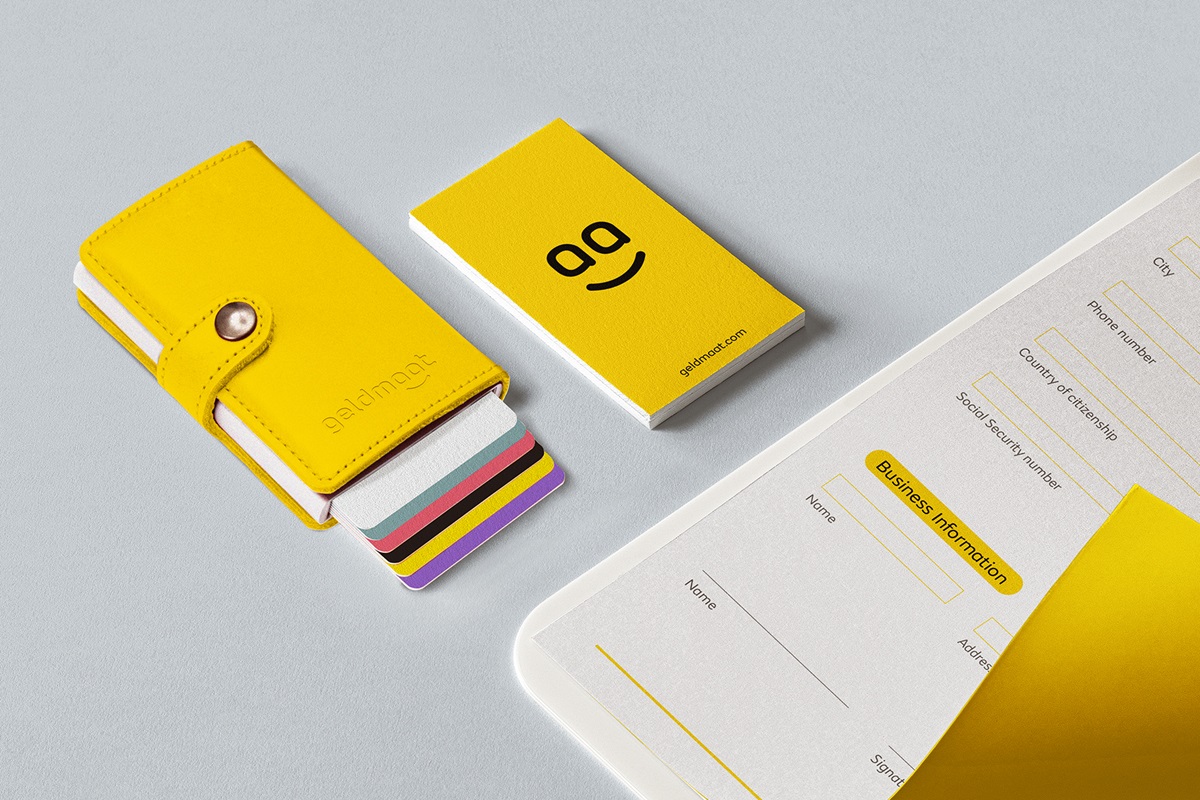
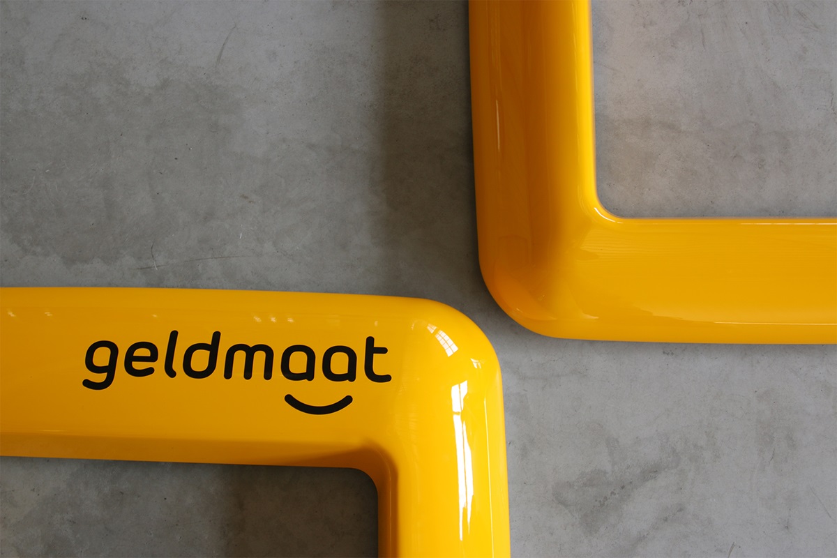
Introducing Geldmaat. Literally translated, ‘Geldmaat’ means “money buddy”. The name was created in collaboration with Glo Brands, and it perfectly captures the accessibility and user-friendliness of the new ATM service. An anthropomorphized money dispatcher that is both easy to use and impossible to forget. It is very practical and very functional – and very Dutch. Beautiful in its simplicity and noble in its social function.
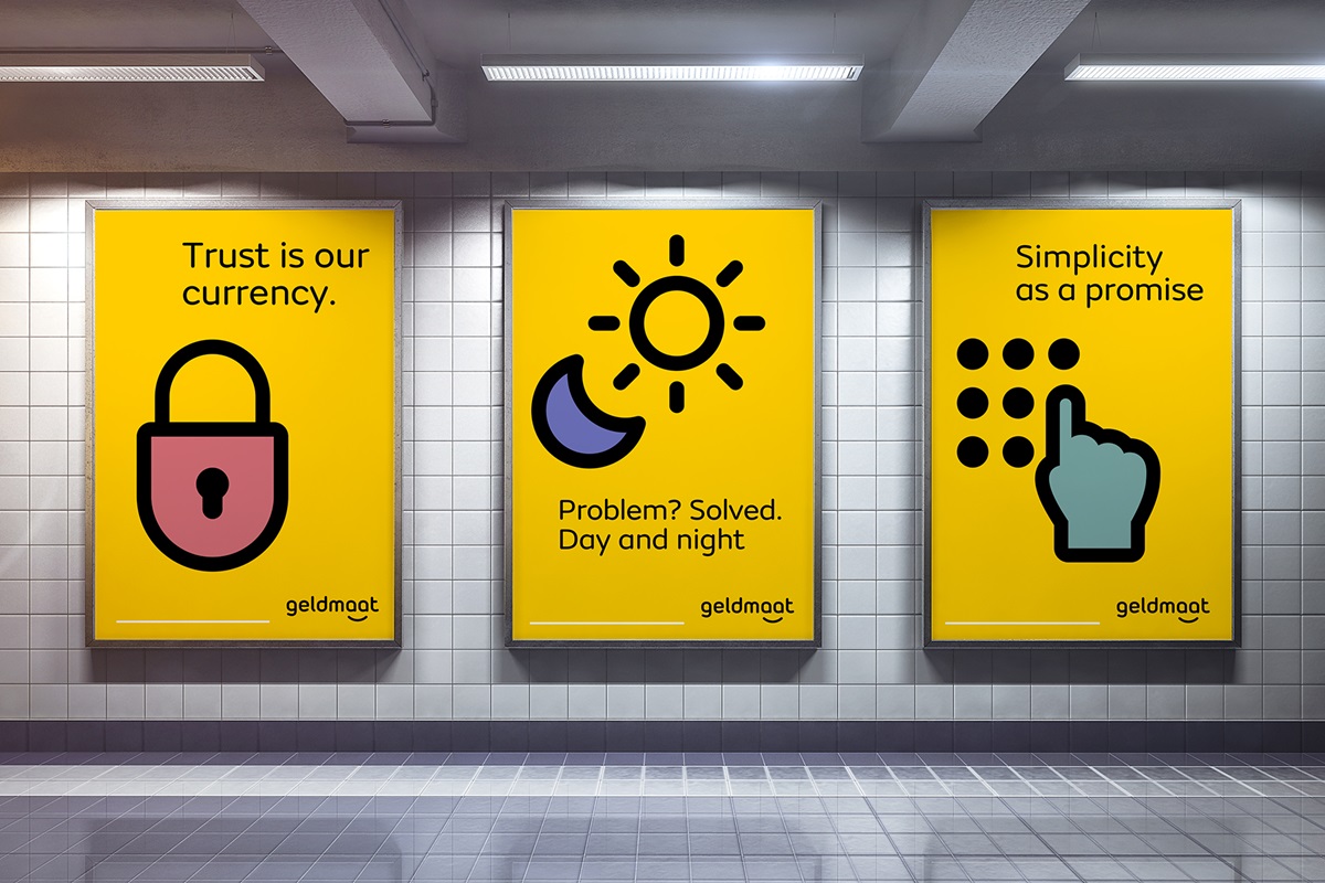
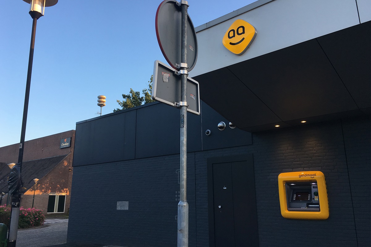
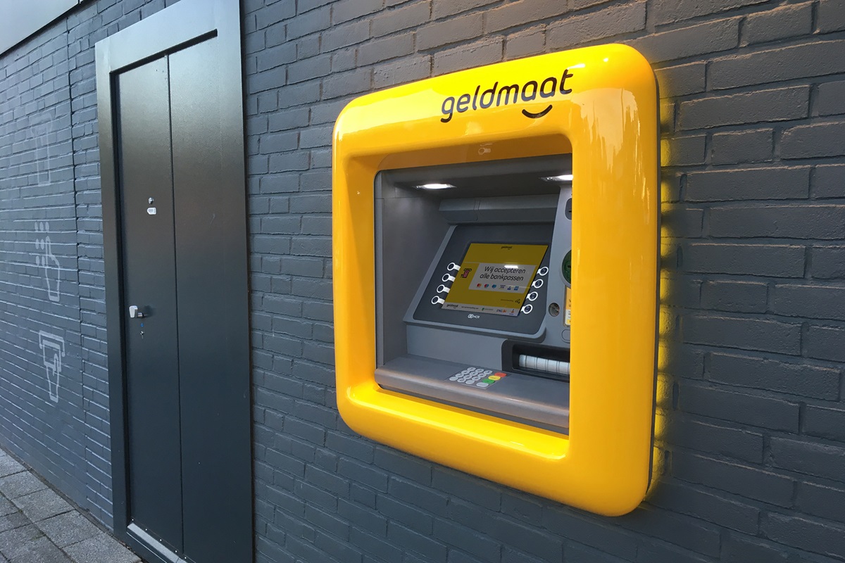
As banks disappear from the cityscape, our aim was to compensate the loss of their ubiquitous logos with a strikingly visible alternative. The choice of yellow was both brand specific and strategic. Yellow is a warm color that functions as a signal, in much the same way pharmacies do: immediately recognisable and visible from afar, day and night. A more practical reason was that we had to avoid using the primary colors of the three banks behind Geldmaat, meaning no green (ABM Amro), no orange (ING) and no blue (Rabobank).
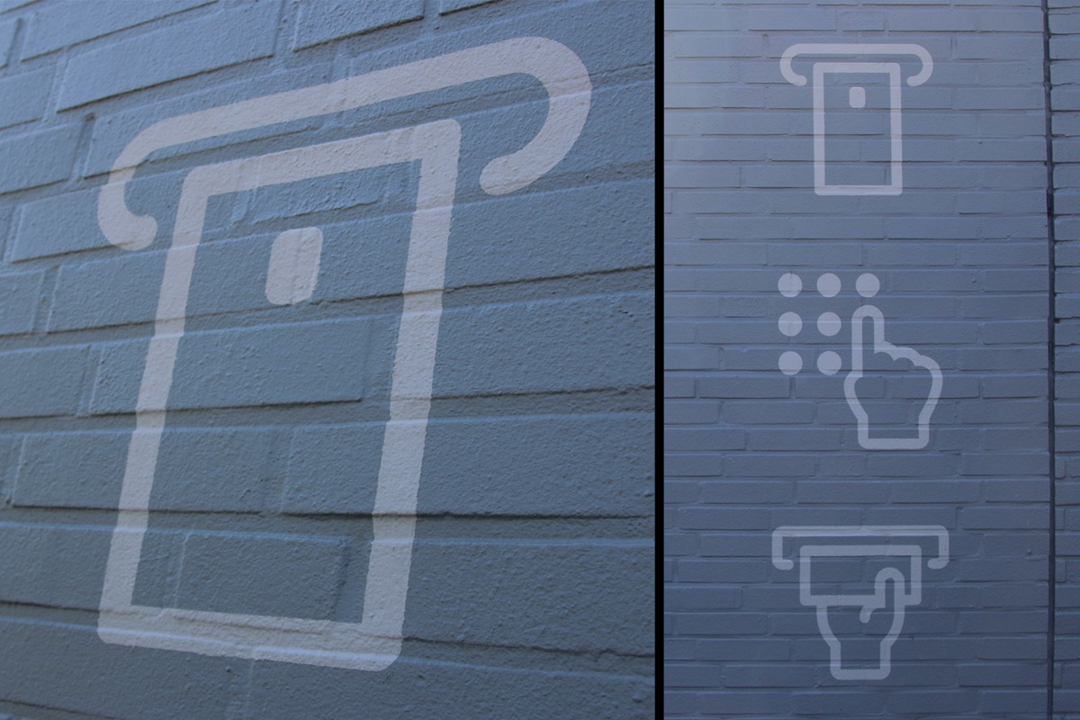
The signage created was purposely designed to look more like traffic signs than branding. We twisted the signage 45º to differentiate it from all the other competing signs on the street. Not to make it more beautiful, but simply to make sure people see it.
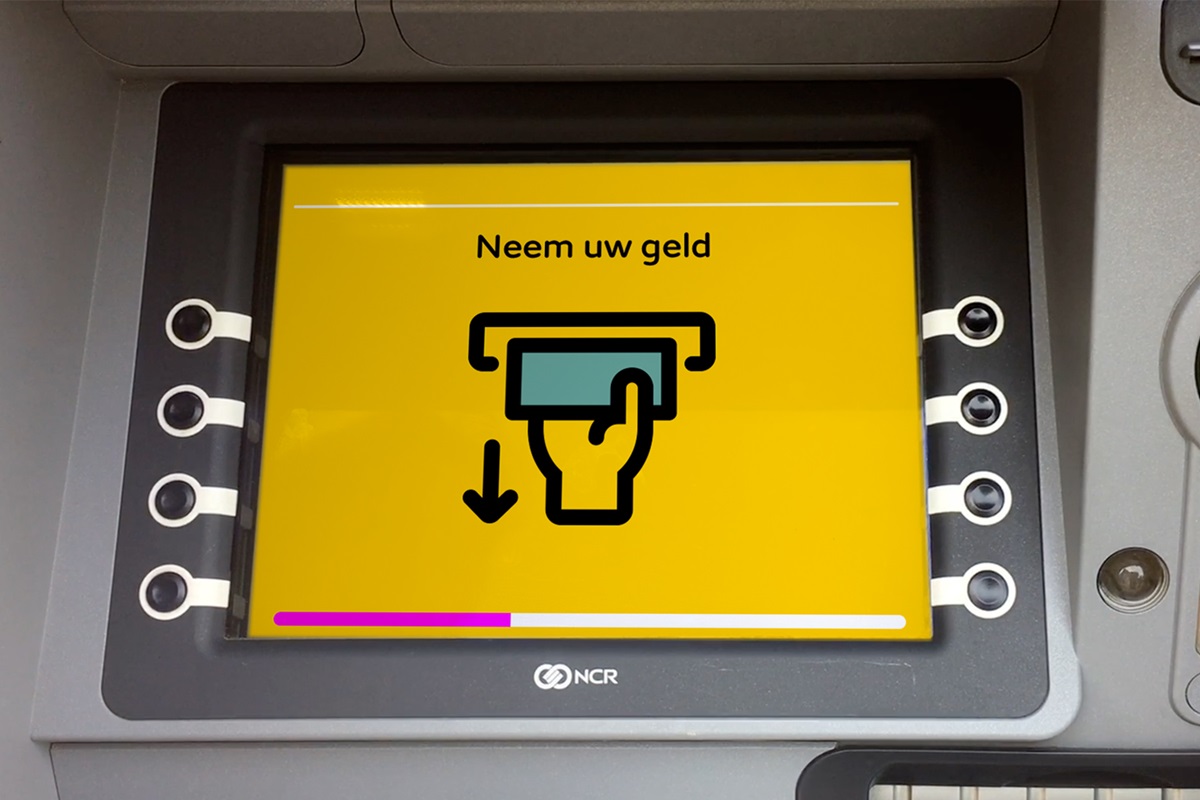
We purposely rounded the typography to increase its user-friendliness. Legibility was key: the font chosen has the smallest difference between its biggest and smallest letters, making it easier to read for the visually impaired. We introduced a system of pictograms so as to avoid words entirely and make the ATM experience simply and intuitive.