Project Description
WPP is repositioning itself as ‘a creative transformation company’. More dynamic. Better joined-up. Easier to navigate. Reorganising around the needs of its clients. And always transforming.
Made up of 130,000+ people in 112 countries, WPP is also the most creative group at the Cannes Lions International Festival of Creativity 2011-2017.
The old visual identity needed to change.
Agency Solution
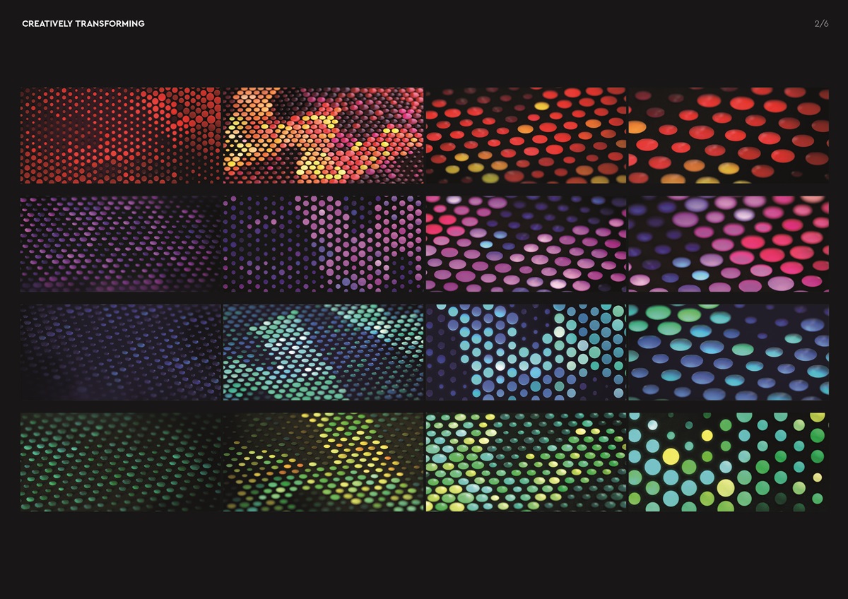
Creative Idea
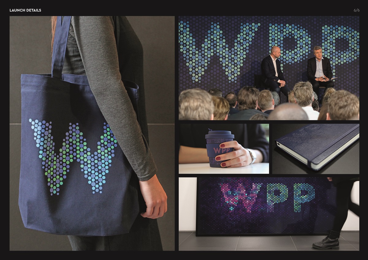
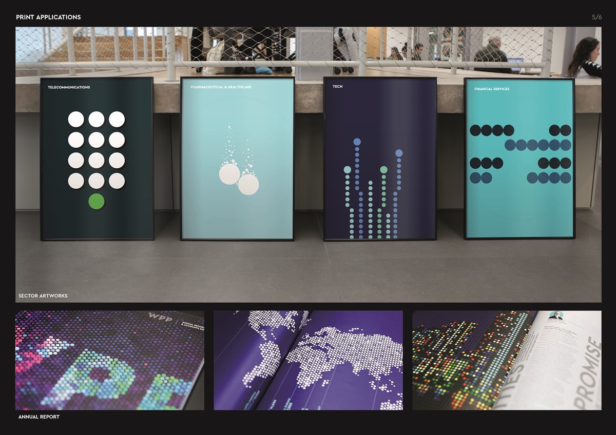
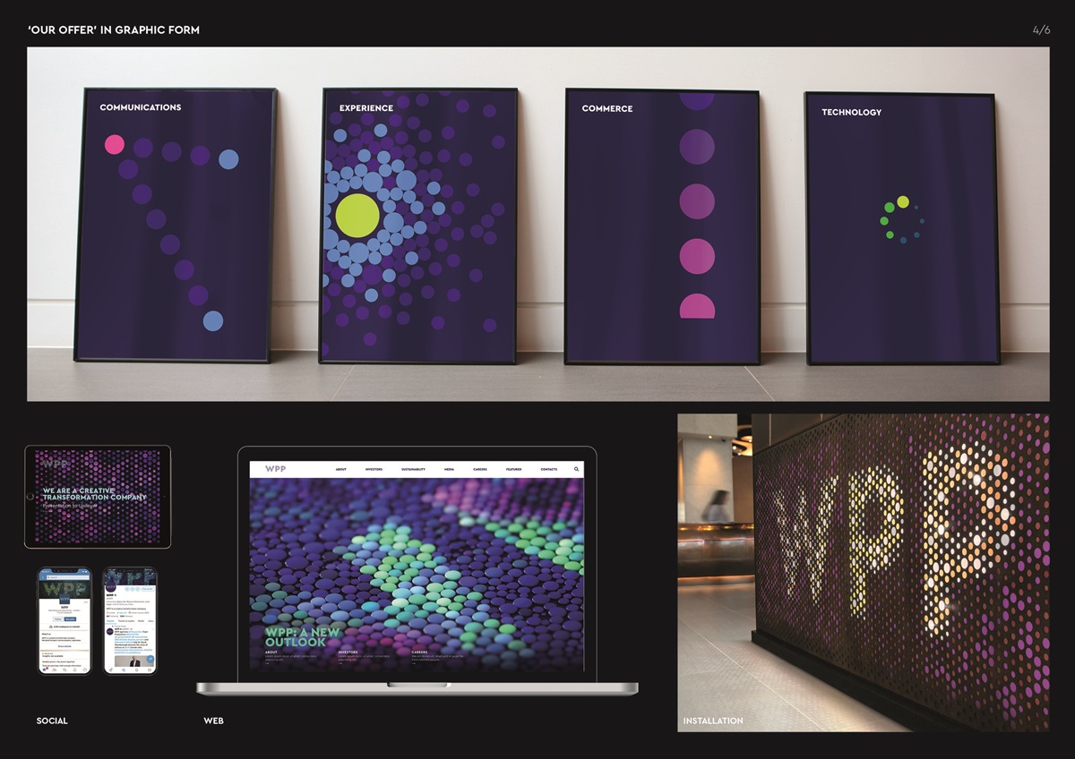
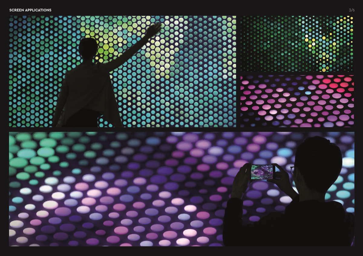
A self-sparking symbol of the ever-changing creative landscape, that expresses the power of the sum through its individual components. Representing WPP’s people, agencies, capabilities and markets, working together as one for clients. Visually, it never stands still. The dots contract, expand and reflect light to create a constantly morphing, chameleon-like surface.
The Execution
A manifestation of constant creative transformation for the creative transformation company. Putting more emphasis on the people who make WPP. An example of collaboration that the company’s new positioning is here to provide.
Every area of the WPP visual identity has changed or is changing – from presentations and stationery, through to campus installation branding and the transformation of wpp.com.