Project Description
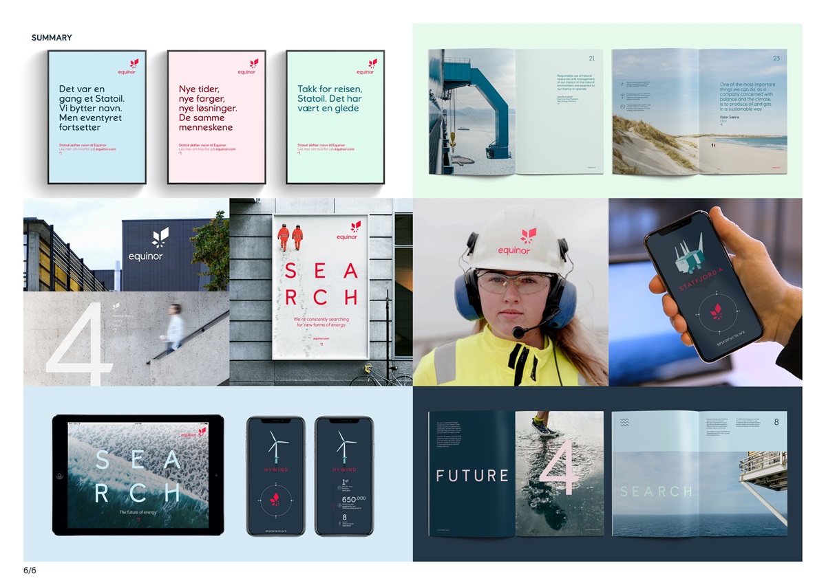
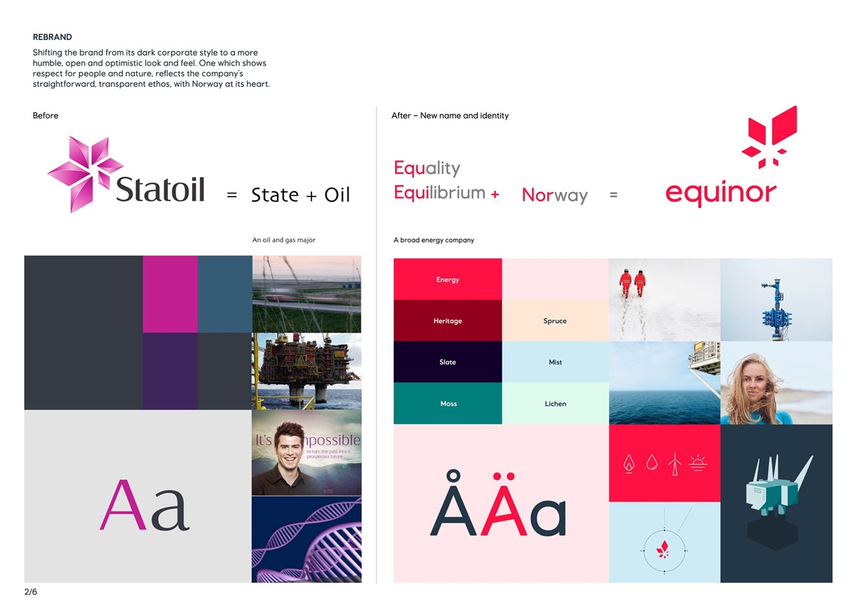
Norwegian multinational company Statoil needed to rebrand, to reflect its transformation from an oil and gas producer to a broad energy company, committed to people and a more sustainable future.
As a global company proud of its heritage, Norwegian values had to play a significant role.
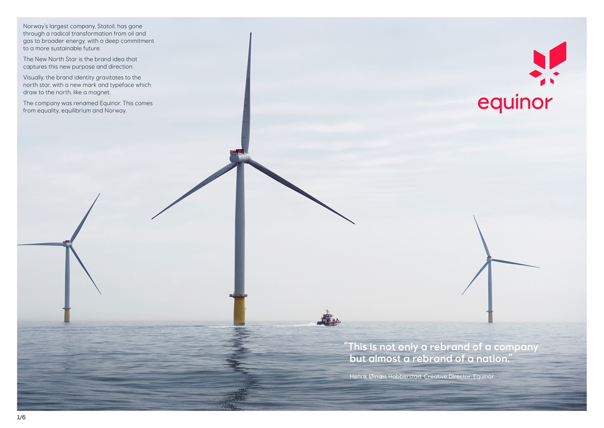
The company was renamed Equinor (from ‘Equality’, ‘Equilibrium’ and “Nor” suggesting a balanced energy company from Norway), and the visual identity was refreshed to reflect the new vision.
The new name and identity were rolled out globally, from May 2018 onwards.
Agency Solution
Creative Idea - The New North Star
The brand identity is based on the concept of the new North Star. This reflects an optimistic sense of purpose and direction, and is a metaphor for the company’s positioning ‘searching for better’.
With the new North Star at its core, the identity elements gravitate upwards to the North.
(The North Star still has great significance to Equinor as it represents a pioneering spirit, light and energy and the Norwegian sky. It also has a practical function of showing the progression from Statoil to Equinor in the mark.)
The Execution
The star symbol in the mark has been redrawn emphasizing a positive rotation to the north.
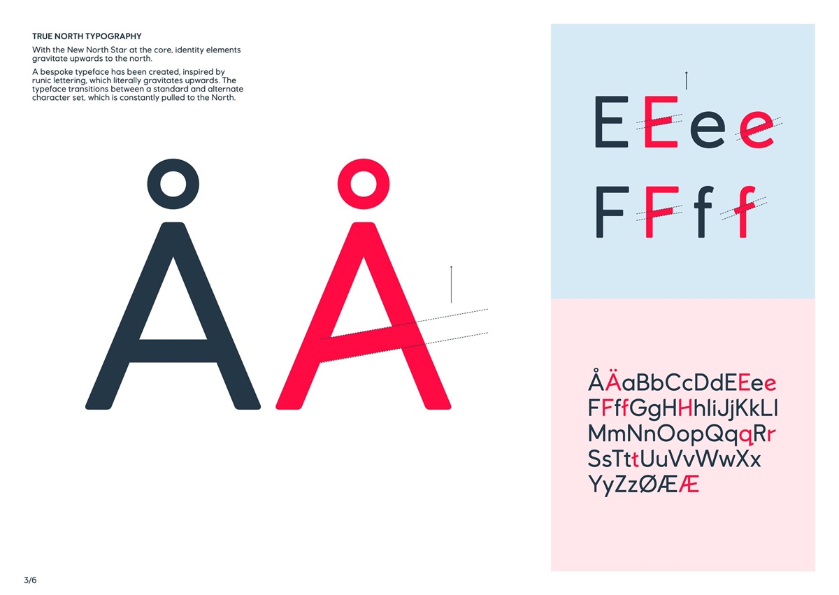
A bespoke typeface has been created, inspired by runic lettering, which literally gravitates upwards. The typeface transitions between a standard and alternate character set, which is constantly pulled to the north.
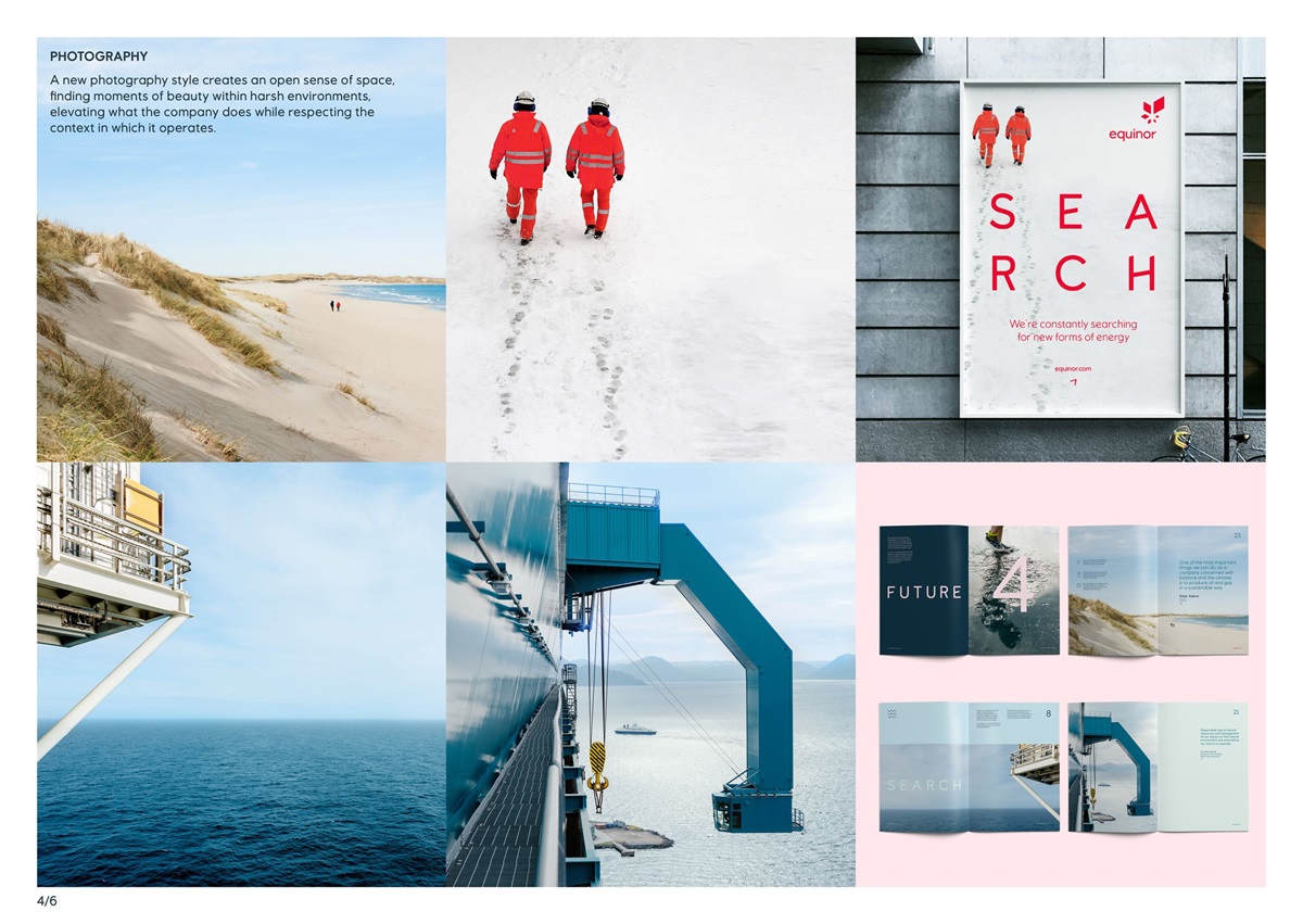
A new brand photography style was defined, which creates an open sense of space, elevating what the company does while respecting the context in which it operates.
Where the sector has traditionally shown imagery of ‘man dominating nature’, we purposely took a more humble ‘Norwegian’ approach.
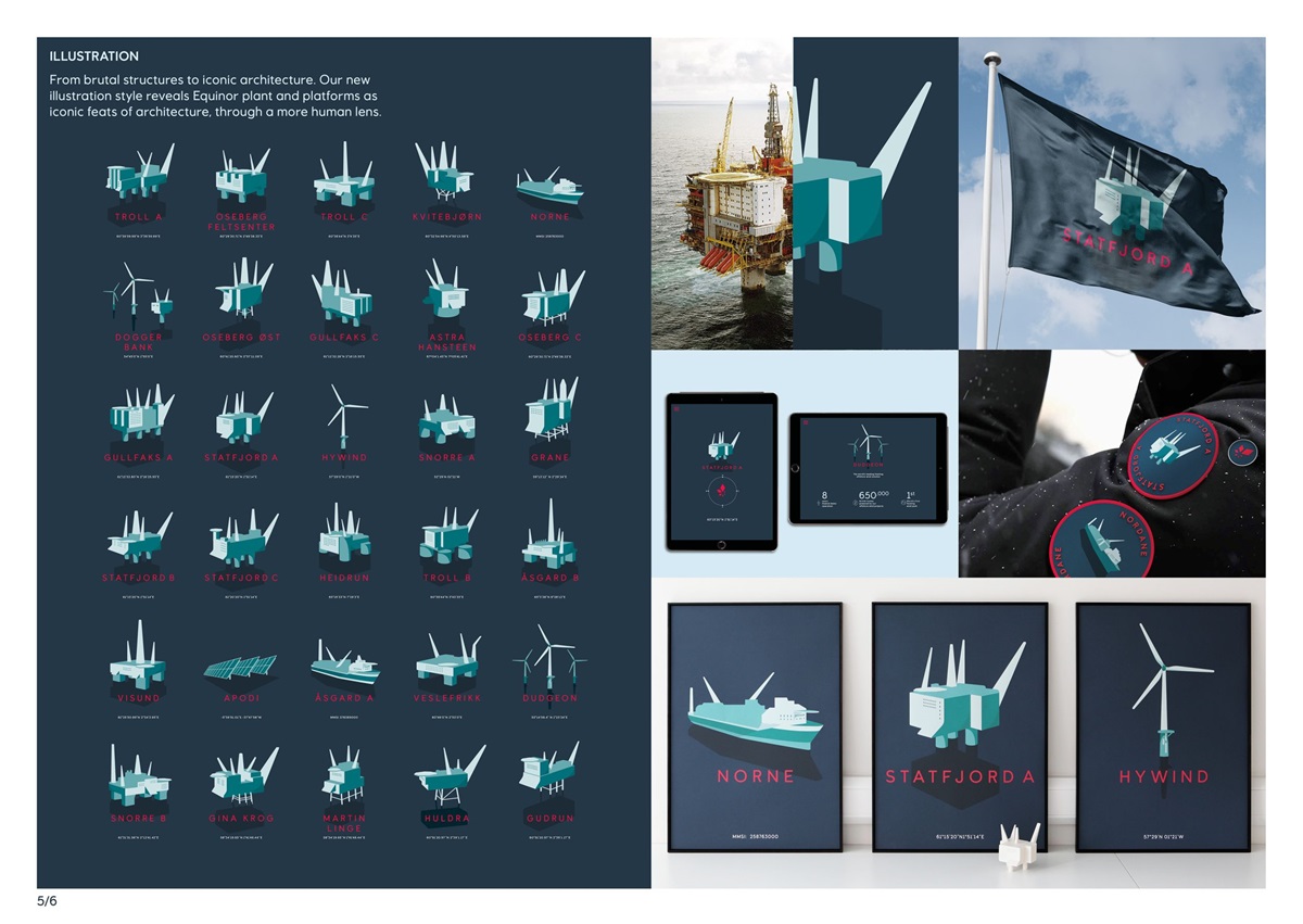
The identity has a strong sense of direction and visual cues which are rooted in Norwegian heritage, which successfully positioned Equinor as a modern, open and progressive broad energy company.
