Project Description
Chinese is the second most consumed cuisine in India, right after Indian. Though immensely popular with people between the ages of 18 to 35, in the midst of their time poor & stressed out lives, they don’t really have those many reasonable options. When it comes to Chinese food, there are mostly just two choices in India. Either, at one extreme, cheap street vendors or, at the other, premium fine dine restaurants, with not much else in the middle.
Discovering this clear gap, Jubilant Food Works; after successfully bringing Domino’s and Dunkin’ Donut to India, decided to start their first independent F&B venture to solve this problem.
FITCH was approached to develop a new restaurant concept that would capitalise on the space existing in the mid-market. The brief was simple - to create a refreshingly new, bold and contemporary take on Chinese dining that millennials would find unintimidating and inviting. A space where they could celebrate every small occasion, turning dining out into a joyous moment.
Agency Solution
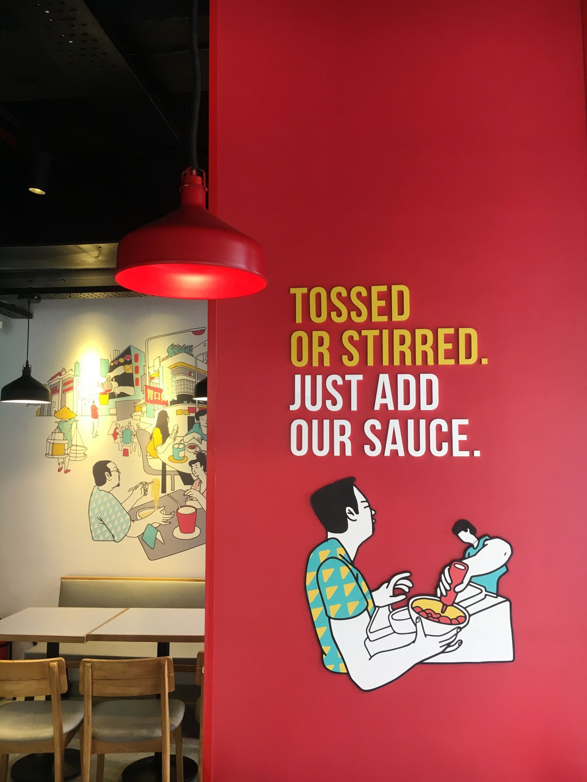
While, the overall space had to clearly call out the type of cuisine, we wanted a fresh new interpretation that did not have to rely on tired ‘Chinese’ clichés like the colours gold, bright red and black and icons like dragons that are so over used in Chinese restaurants across India. Based on the central idea of ‘Progressive Familiarity’, we decided to capture the essence and magic of an Asian street. An authentic, yet unexplored interpretation of the ‘real Asia’.
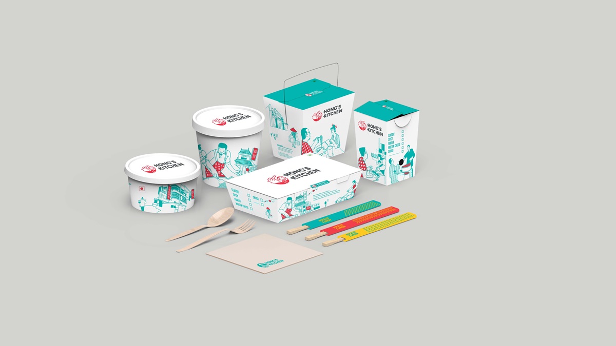
This is clearly visible in our illustration style. Made in collaboration with the well-known artist Sameer Kulavoor, the master illustration brings to life the organised chaos behind the sights, sounds, smells and theatre of food being prepared at street stalls, and works as a perfect metaphor for the live cooking kitchen present in the restaurant as well.
A core element of our visual language is the play in perspective, giving the composition greater depth. Certain elements have been exaggerated, whereas, others have been underplayed to create a sense of drama, making the landscape visually more exciting.
Throughout the illustration are multiple little elements placed on different layers at various points to add a sense of curious fun. This intentionally overwhelming approach ensures that every time customers look at the illustration, they discover something new.
With the use of vibrant colours and modern illustration style, we’ve perfectly fused a traditional setting with a contemporary treatment, vividly captured the vibrancy of life and moments of joys.


