Project Description
Best known for its original department store in London’s Piccadilly, Fortnum & Mason also has stores in St Pancras, Heathrow and Dubai, as well as online. But no matter where in the world this iconic brand is purchased, people want a keepsake that embodies the exclusive London store – almost as if they've experienced the glittering grandeur for themselves.
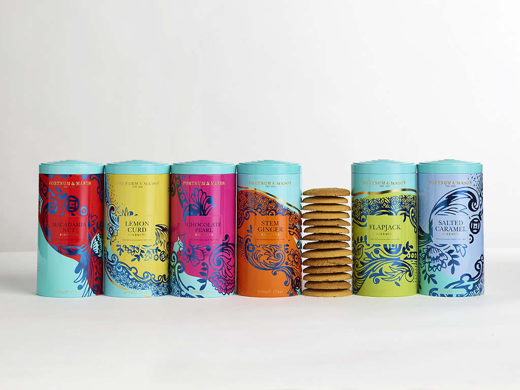
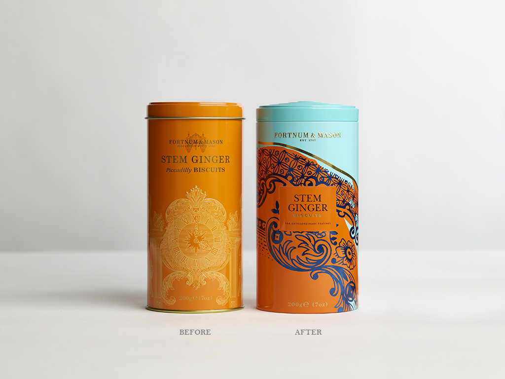
Among Fortnum's many products is a delectable array of classic English 'Piccadilly biscuits', made to the company's very own special recipes. Our task was to update the design of the previous tins, which featured the Fortnum's clock, and create unique packaging that was eye-catching, bold and gift worthy, and that embodied Fortnum's unique personality.
Agency Solution
Biscuits are the perfect partner to a cup of tea - a pairing which got us thinking about beautifully decorated china tea sets, traditionally used to serve tea and biscuits. With the start of an idea, we scoured F&M's archives to find decorative ceramics and fine china from the Regency period when the store originates.
Referencing the Fortnum’s archives, architectural details of the Piccadilly store, and fine Georgian ceramics, we designed our very own decorative plate made up of carefully varied flowers and flourishes to incorporate in our new packaging design.
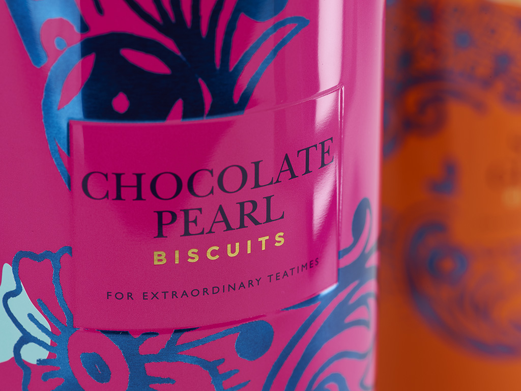
For that special twist of Fortnum's eccentric British personality we cropped and scaled our plate design in six unique ways and added six vibrant colours – one for each biscuit flavour.
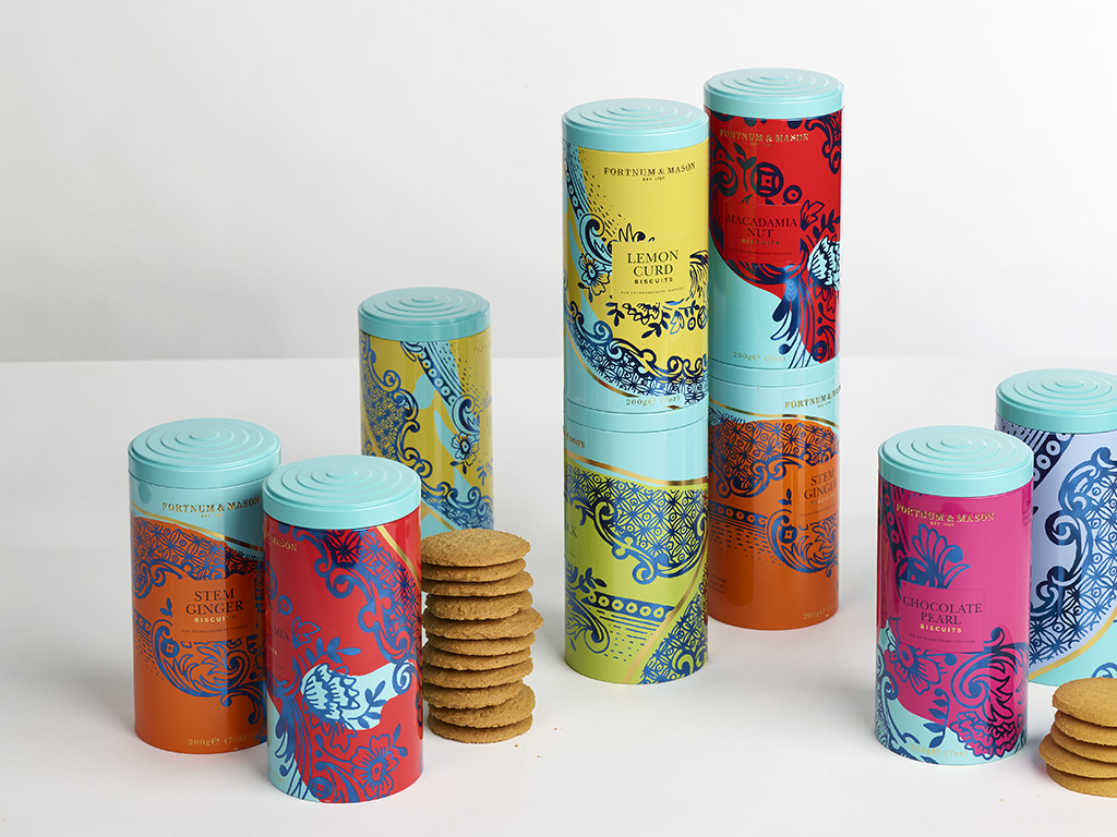
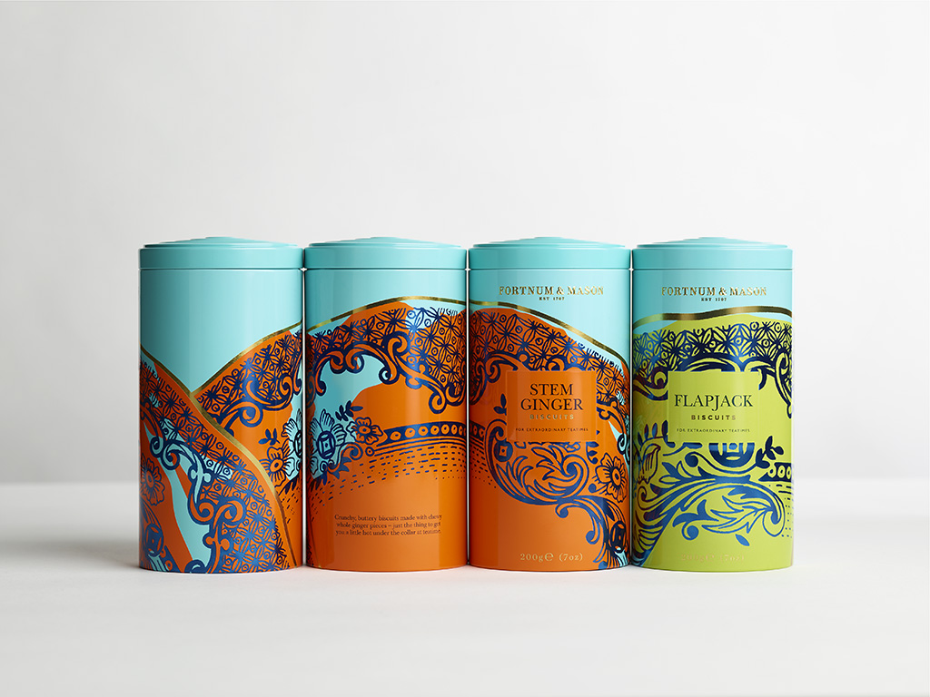
The mix of striking metallic and non-metallic colours, applied in bold blocks that don’t always match up with the edges of the pattern, help give this collection its contemporary feel.
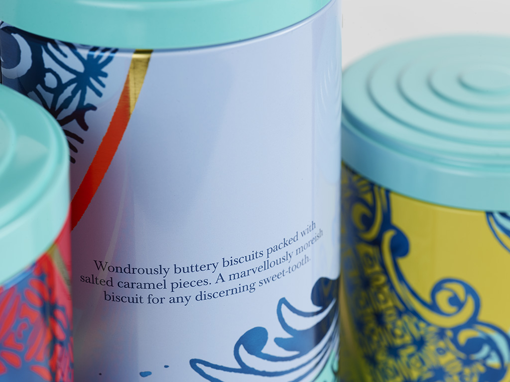
With meticulous detailing, we ensured that each section of the plate flows around each tin to form one seamlessly connected pattern, whilst a slightly worn treatment references well-loved ceramics used in many a teatime.
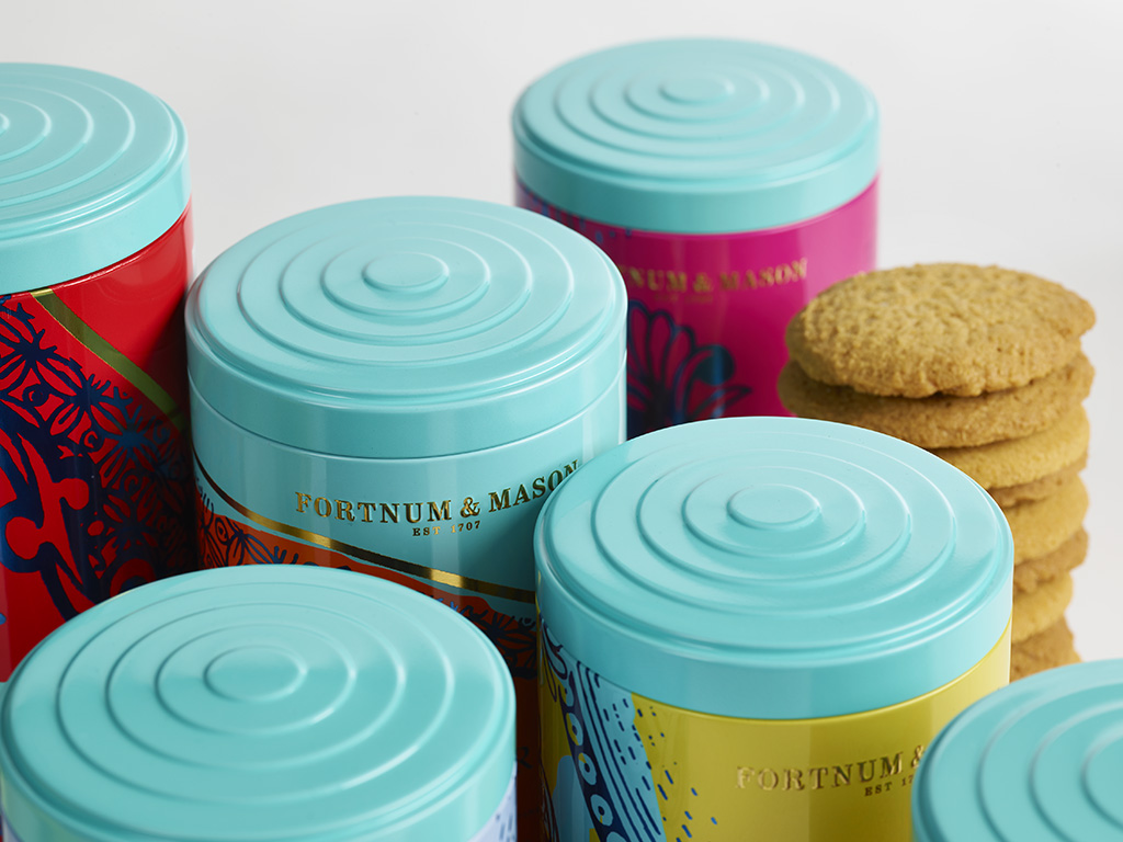
A de-bossed square in the middle of each design works as a consistent and calm focal point, whilst the bespoke lid – inspired by vintage tea caddies and biscuit tins – brings a consistent band of Fortnum & Mason’s signature 'Eau de Nil’ colour to the range.