Project Description
Description:
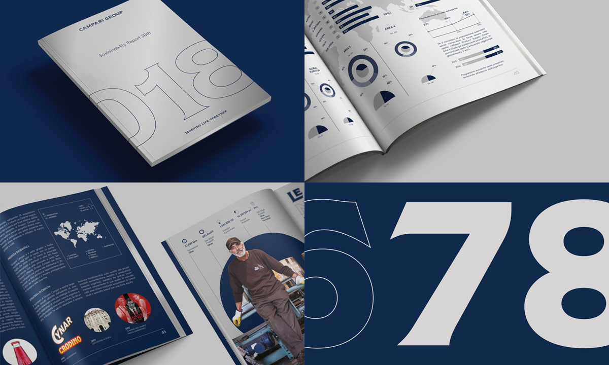
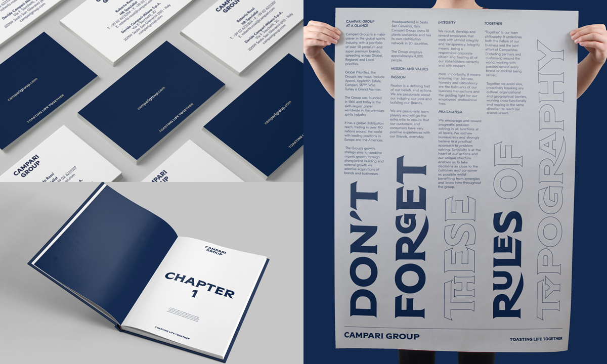
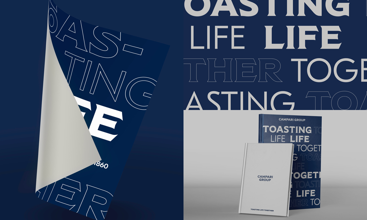
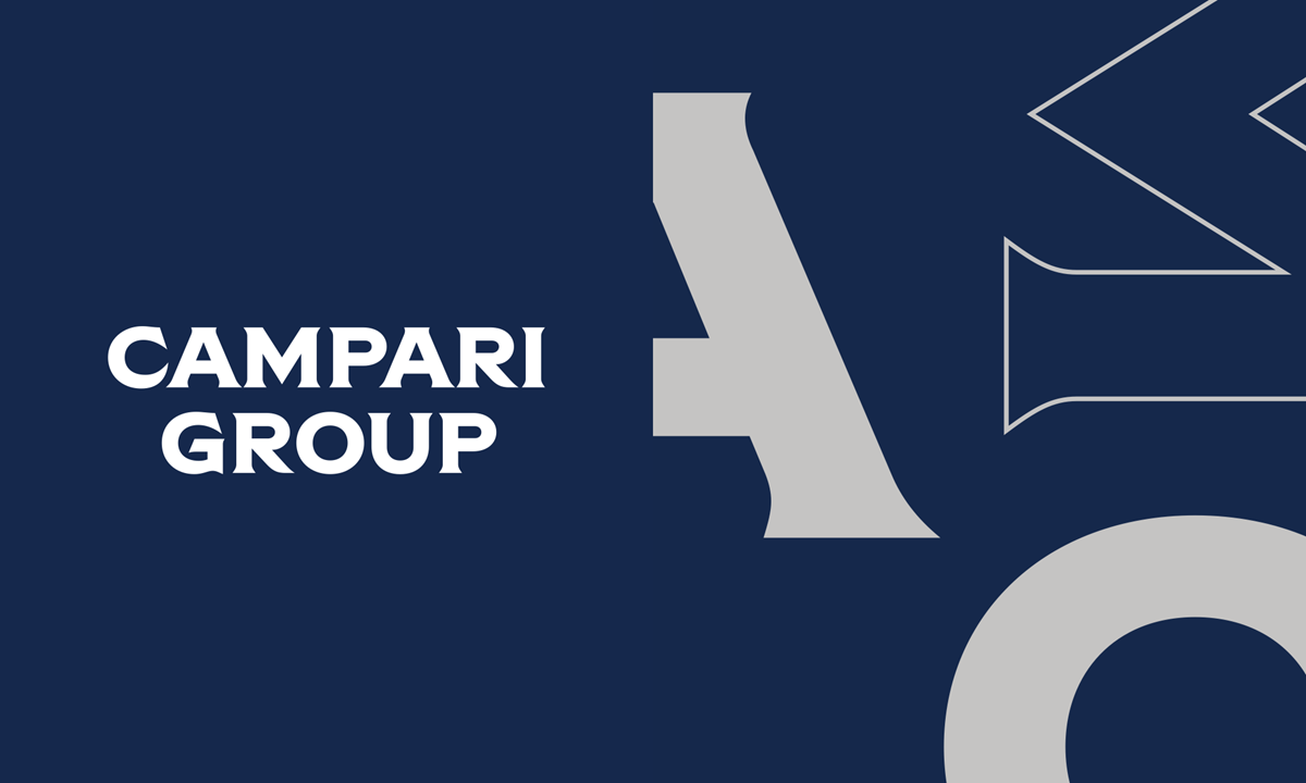
Campari Group rose through its history from being in 1860 a single product brand, the bright red bittersweet aperitif sipped in downtown Milan created by the genius mind of Gaspare Campari, to today’s house of brands, a major player in the global branded spirits industry, with a portfolio of over 50 premium and super premium brands, marketed and distributed in over 190 markets around the world. Employing around 4,000 people all over the world and having a close relationship with a wide range of trade stakeholders Campari Group had the stark need to refresh its corporate identity with the clear goal of firstly expressing the strategic shift, from product brand to house of brands, while lighting up uniqueness and legacy and premiumizing its image and unique personality.
To this identity, all sorts of internal and external initiatives had to be aligned to make them the first expression of a global corporate brand, first the Campari Academy.
The Campari Academy had its goals set in becoming the best-in-class institution in the training of bartenders worldwide, becoming an inspiration reference point for a community of creative individuals and in general reinforcing the Campari Group brand equity. It needed a pprofound refresh to aid in reaching these goals.
Agency Solution
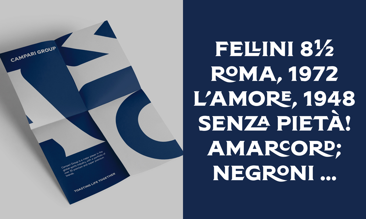
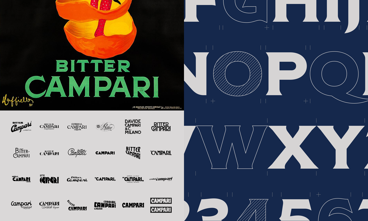
We delved into research and explored all sorts of angles in creating the new corporate visual identity for Campari Group. We started from its unique artistic heritage and defined a personality that guided the design exploration:
An Italian Heart Italy means excellence - means a moderate, balanced consumption model, means being open, respectful of other cultures. But…
A Northern Italian (Lombardy) Mindset:
means speed and pragmatism
means rigor, discipline, method, organization
means ambition and being entrepreneurial
means understatement.
And is profoundly related with the mission statement “The Smallest Big Company”, core of the Group DNA.
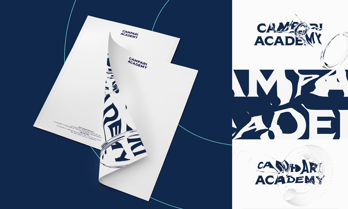
To support this personality, we generated an identity that could be expression of a duality based on strong elements, on the one hand solidity built with the experience and historicity of the brand, on the other a growing heritage of stories related to individual products. This was done through a bespoke typography derived from the artistic heritage of the brand and a defined colour palette that clearly takes it far from the product brand and sets a premium territory, an affordable luxury perception.
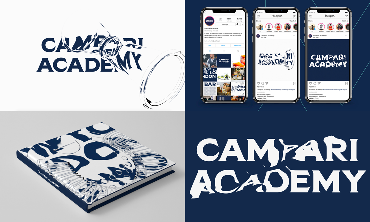
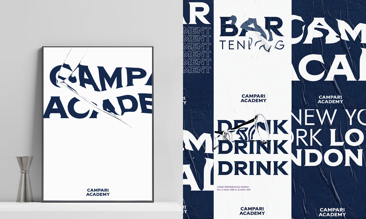
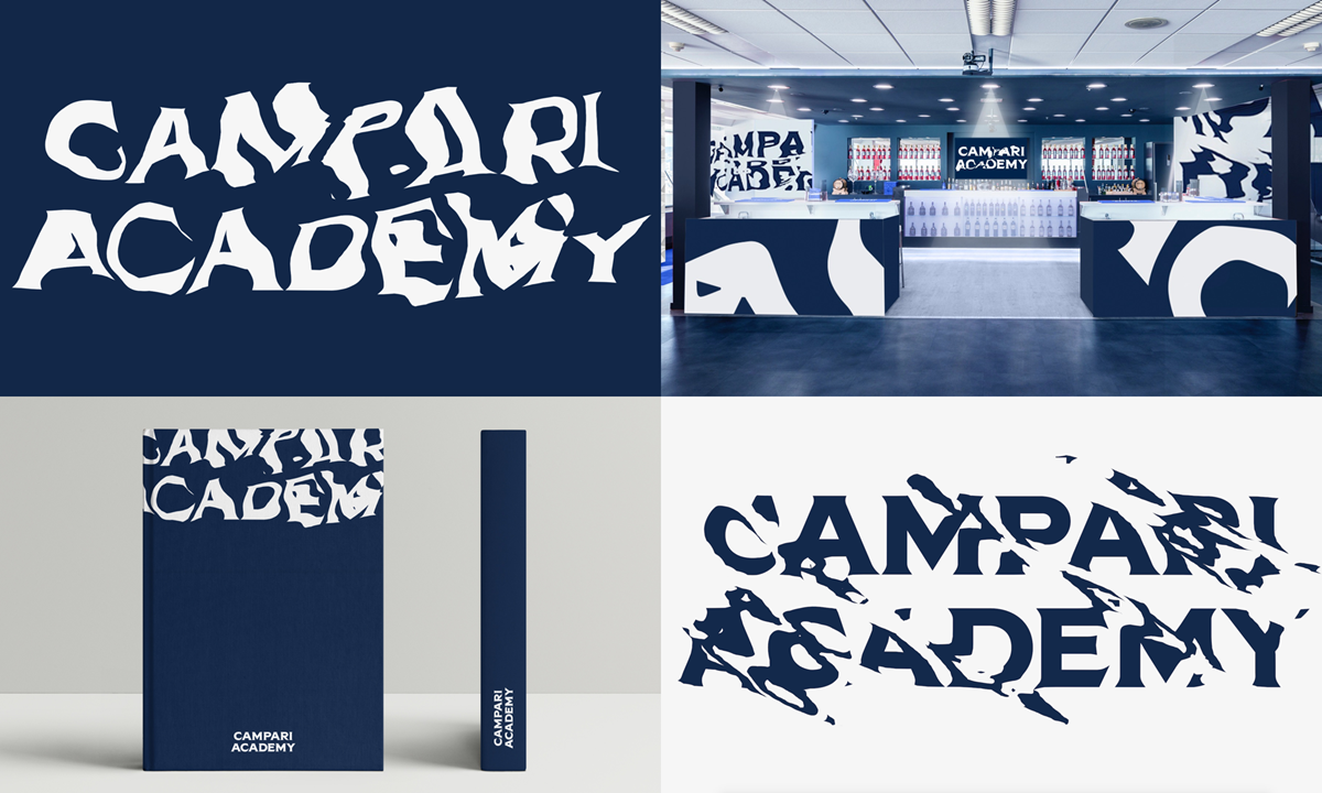
In this framework, the Campari Academy needed to be a real “alpha institution” within the bartending world, one that does not exist yet. Contemporary, challenging, authoritative and engaging. We created a new visual identity that sparked from the concept of Laboratory:
Are you sure that there is just one straight-codify-orthodox-conventional way to execute and mix your cocktail? Enter the lab, open your mind, experiment and have fun: there is no such place in bartending world that keeps challenge the boundaries of your creative mind.