Proudly Croatian
By Superunion, London, UK
For Plava Laguna
Highly Commended in category Design & Branding
In subcategory Craft - Typography for Design
Project Description
In 1957, Plava Laguna were pioneers, introducing international standards of hospitality to Croatia. Their fresh blue identity perfectly captured the sunny skies and sparkling sea. A place that always lived up to the promise. But with success comes imitation.
Today, they are drowning in a sea of blue; blue logos and blue imagery are the sector norms.
We were commissioned to create a new visual identity, helping to reposition the brand as the leading and authentic Croatian holiday company.
Today, they are drowning in a sea of blue; blue logos and blue imagery are the sector norms.
We were commissioned to create a new visual identity, helping to reposition the brand as the leading and authentic Croatian holiday company.
Agency Solution
Today’s travellers are searching for authenticity but, to our surprise, we discovered that none of their competition celebrated their Croatian roots.
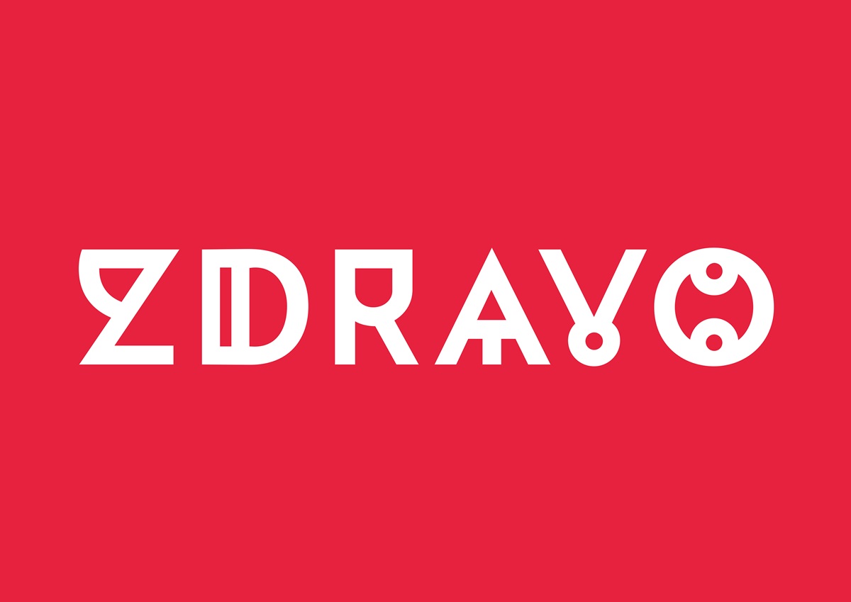
With over 60 years’ experience there is no other holiday brand is more Croatian than Plava Laguna. To reflect this, we mined Croatia’s rich culture for the new visual identity. At the heart of this is a very special typeface, unique to the country, supported by a colour palette inspired by the white and red of the Croatian coat of arms.
With over 60 years’ experience there is no other holiday brand is more Croatian than Plava Laguna. To reflect this, we mined Croatia’s rich culture for the new visual identity. At the heart of this is a very special typeface, unique to the country, supported by a colour palette inspired by the white and red of the Croatian coat of arms.