Old and New Collide: Reinventing Shakespeare’s Globe
By Superunion, London, UK
For Shakespeare’s Globe
Crème de la Crème in category Design & Branding
In subcategory 360 Integrated Design
Project Description
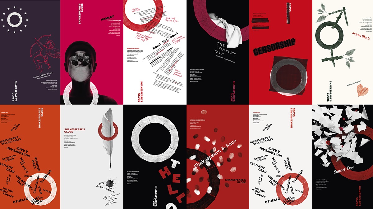
Shakespeare’s Globe is like nowhere else in the world, a faithful re-creation of Shakespeare’s 1599 Globe playhouse. It was built in the 1990s, at the original London riverside site, as a radical theatrical experiment to capture the authentic physical conditions of the original. The Globe brings modern ideas, performances and audiences into a uniquely historic, open air space with natural light and a standing crowd. It’s raw, real, and more than any other theatre, it’s alive.
Our brief was to bring that unique, visceral spirit to life and celebrate the historic work of the Globe in a contemporary way. In recent years the Globe had lost its focus on the authentic experience and faced negative press and confusion around their artistic approach. This along with perceptions of the theatre as a heritage, tourist attraction, and a visual-identity that was not communicating their core message drove the need for change.
Our brief was to bring that unique, visceral spirit to life and celebrate the historic work of the Globe in a contemporary way. In recent years the Globe had lost its focus on the authentic experience and faced negative press and confusion around their artistic approach. This along with perceptions of the theatre as a heritage, tourist attraction, and a visual-identity that was not communicating their core message drove the need for change.
Agency Solution
The new visual-identity puts the original, immersive experience right back at the heart of the Globe. Old and new collide to capture the energy of a Globe performance, and lets it loose across everything. Authentic conditions combined with modern ideas, express the true Globe spirit to faithful fans whilst attracting new audiences seeking unique, stimulating experiences.
The Globe itself is centre stage. The original theatre was nicknamed ‘The Wooden O’, this became an inspiration. We found the last complete piece of oak from the building’s construction and created a hand-crafted block in the unusual 20-sided shape of the theatre.
A print from this wood-block became the logo symbol and the source of all the action. With no fixed size or position, the symbol interacts freely with content. Angles from the symbol create a dynamic framework. A collage approach underpins a consistent yet open set of playing conditions to experiment within.
The colour palette – ten shades of red, five shades of black and five shades of white – is influenced by the colour coded theatre flags of Shakespeare’s time as well as the common colours and variable shades of early printing inks. Along with the Wooden O symbol, colour provides a distinctive visual signature while imagery and headline typography are allowed to be expressive, eclectic and free.
The typeface Effra was chosen for its roots as well as its contemporary features. A modern update of the first commercial sans serif, its heritage lies in London’s historic type and printing family Caslon.
Modern, standard formats and stock are avoided in print, and editorial design remixes the layout principles of Shakespeare’s first printed collection of 1623 – The First Folio – embracing its unusual grid and typographic idiosyncrasies to further express the collision of past and present at the heart of the Globe.