Project Description
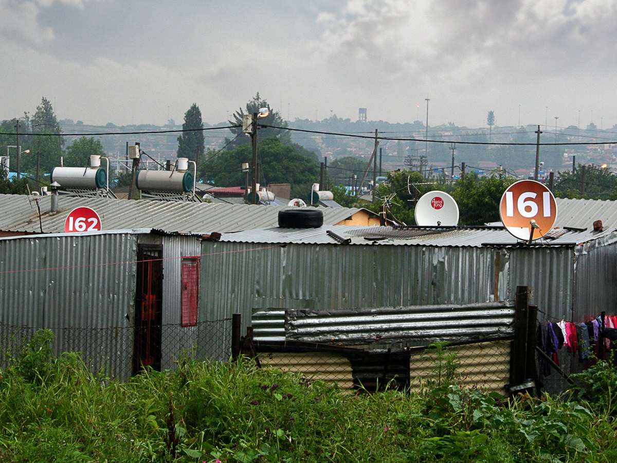
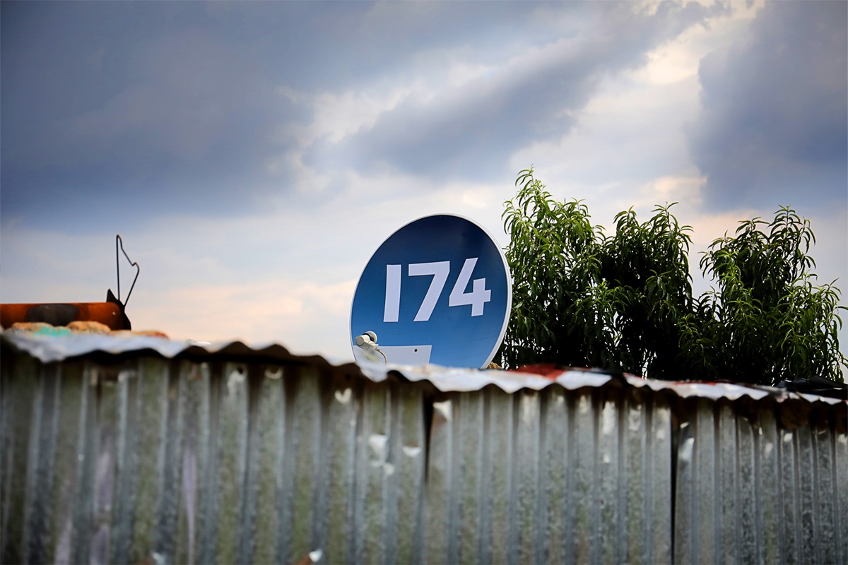
The University of Johannesburg’s Emergency Medical Care Faculty trains world-class paramedics. Despite their expert training, there’s one problem that repeatedly hinders their work. In South Africa’s dense, growing metropolitan areas, most people don’t have visible house numbers. This means paramedics and ambulances can’t find the houses they’re called to – and often arrive too late, with tragic consequences. House numbers are a rarity, BUT almost every house has a satellite dish. We began with a pilot project, on a budget of less than 3000 Euros, to make satellite dishes that
function as wayfinding devices to display house numbers. It solved a major problem for the Emergency Medical Care Faculty. The public and media support gave us the leverage to approach two major corporates for sponsorship. In the
next few months we will roll out 50 000 more satellite dishes nationwide.
Agency Solution
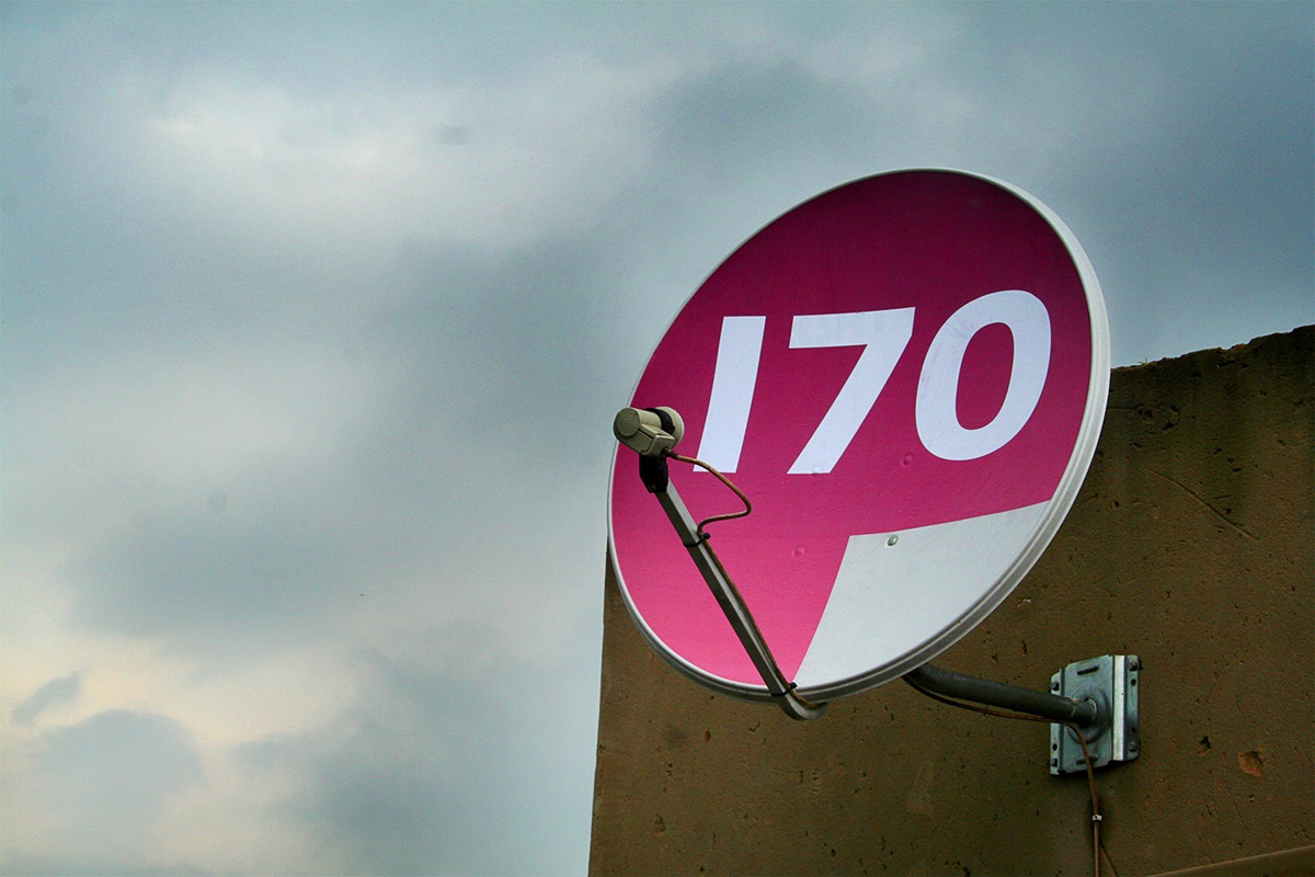
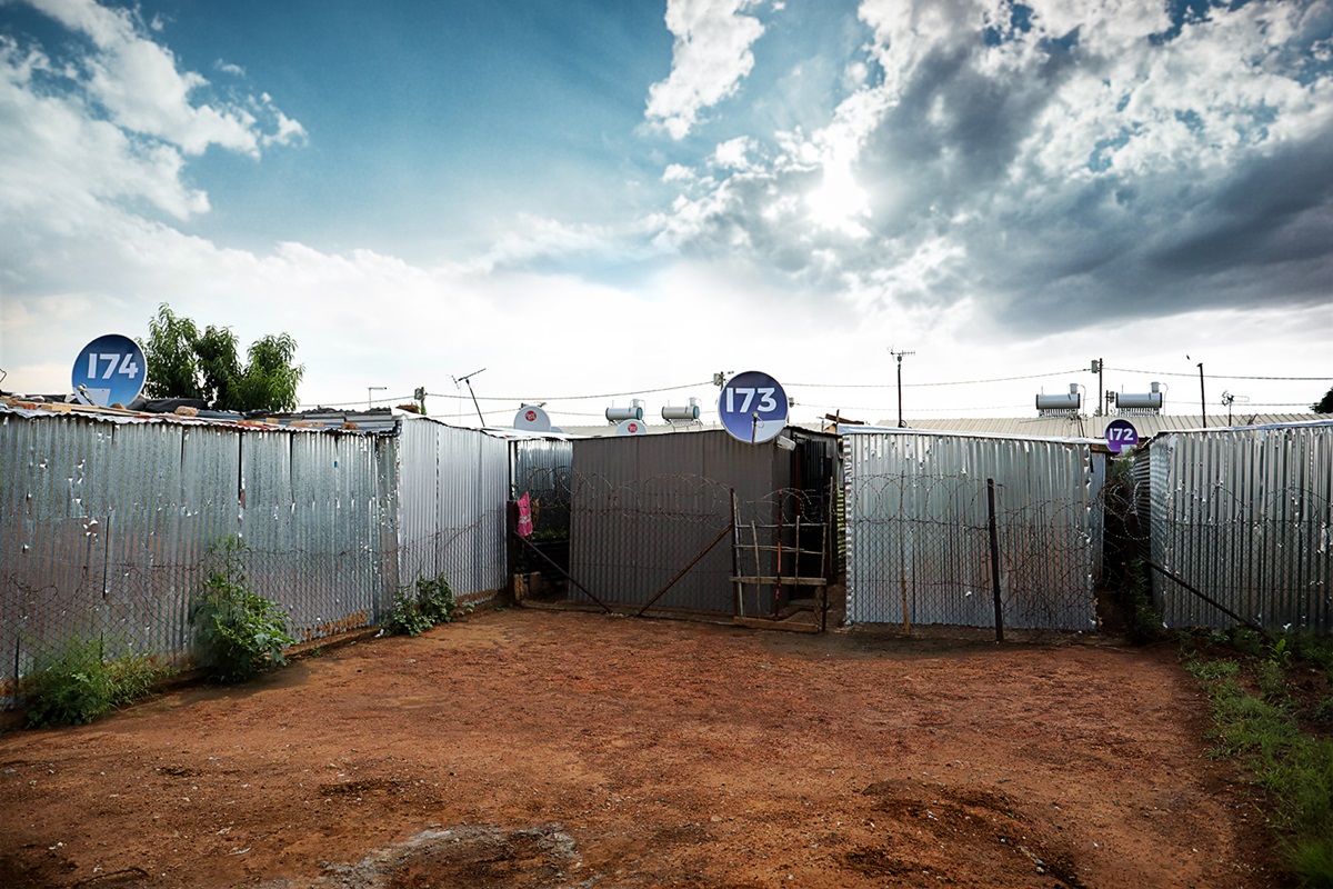
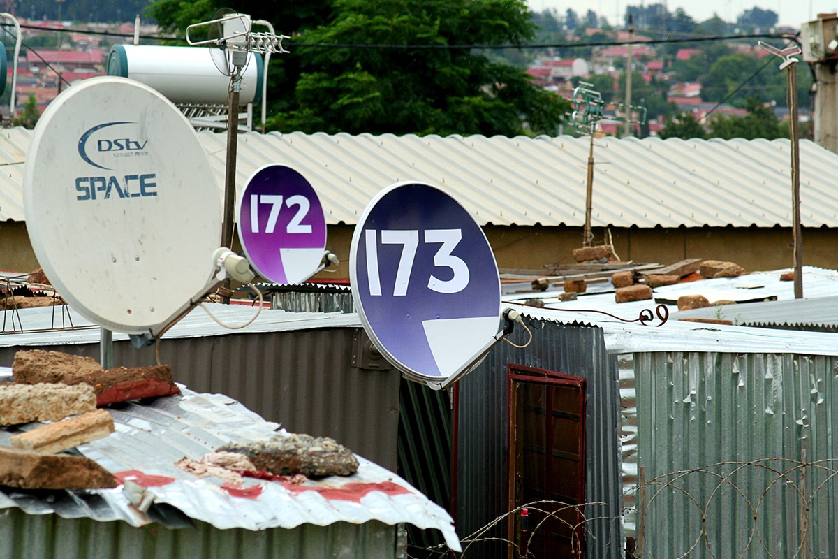
We used Kliptown in Soweto as a pilot, since it’s a dense metropolitan area with few visible house numbers - and a lot of satellite dishes. It’s also an area serviced by the EMS. We turned the satellite dishes into wayfinding signs to display house numbers, using vinyl decals. This way existing satellite dishes can be used. We began with a small pilot project in one street. We had to find a way to display the numbers without affecting the satellite signal, so we couldn’t use any reflective materials. We also needed something durable, inexpensive and easy to apply. We designed vinyl decals which satellite installers applied to the dishes quickly
with a heat gun, and then tested their efficacy by doing trial runs with the ambulances in the area. For the next 50 000 we devised a system whereby dish installers will be given a reusable magnetic stencil and high-gloss rust-proof spray
paint. To maximise legibility the design was kept simple by employing clear, bold typography.