Project Description
In India, the power of design is under estimated. It is viewed as a logo design exercise or just pretty graphics on a label, but rarely seen as a strategic solution to achieve business objectives. At the same time, we sensed that Landor was wrongly perceived – some thought of us as just a strategic brand consultancy, while others perceived us to be a design hot shop. Additionally, we were well-known for our work in corporate identity, but not for our consumer-facing work, especially packaging, which is emerging as a key growth area in our industry. It was time to shatter these two misconceptions.
Agency Solution
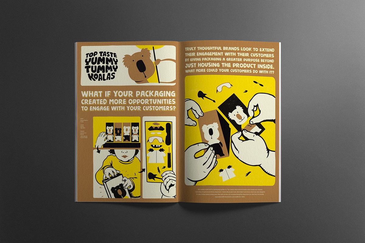
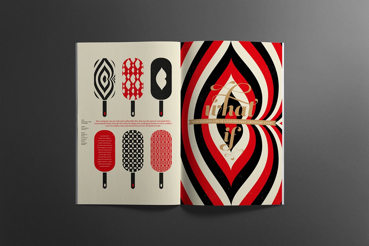
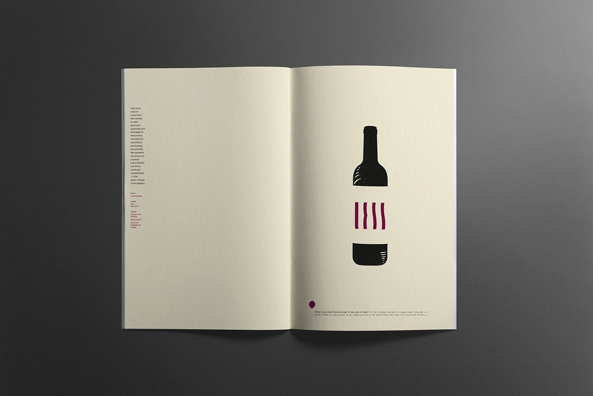
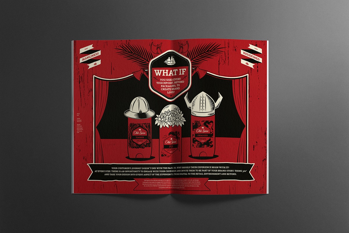
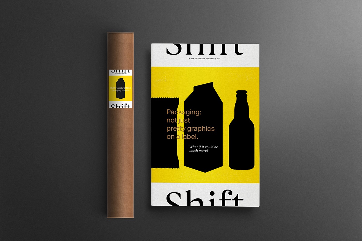
Our bi-annual journal was conceived to challenge norms, shift perceptions and spark new thoughts in the minds of CMOs of FMCG companies in India. Each volume would focus on one branding topic of burning relevance, brought to life through powerful visuals and compelling narrative.
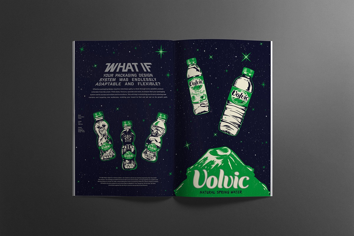
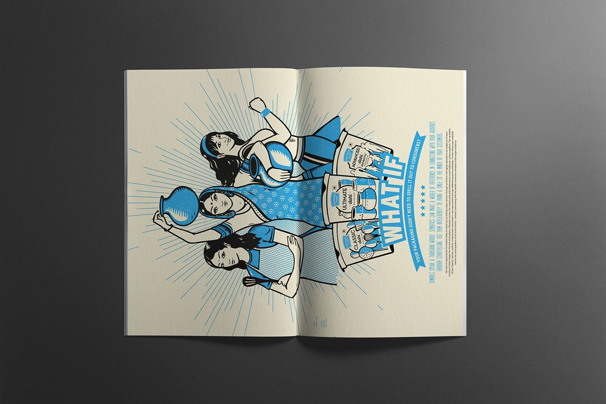
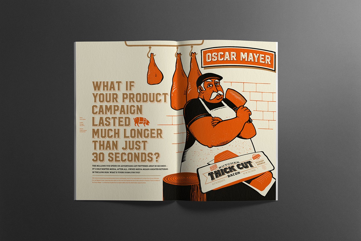
As a global agency with local capabilities, we needed to communicate our strong understanding of international best practices and local nuances. We sought inspiration from the Sivakashi style of design, which is usually seen on matchboxes and firecracker packages. While the classic Indianness remained, we contemporized it by limiting the colour palette for each spread to 2 – 3 colours. Each piece of work was showcased in a compelling, illustrative format with varying treatment extending from a movie poster to the comic strip.
150 limited copies of Shift were meticulously silk-screen printed by hand, carefully rolled into their cylindrical cases and hand delivered to every prospective client.