Project Description
Sir Jackie Stewart is launching a new charity to combat dementia. He wants it to be dynamic and innovative.
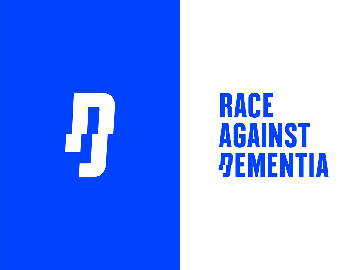
We called it Race Against Dementia.
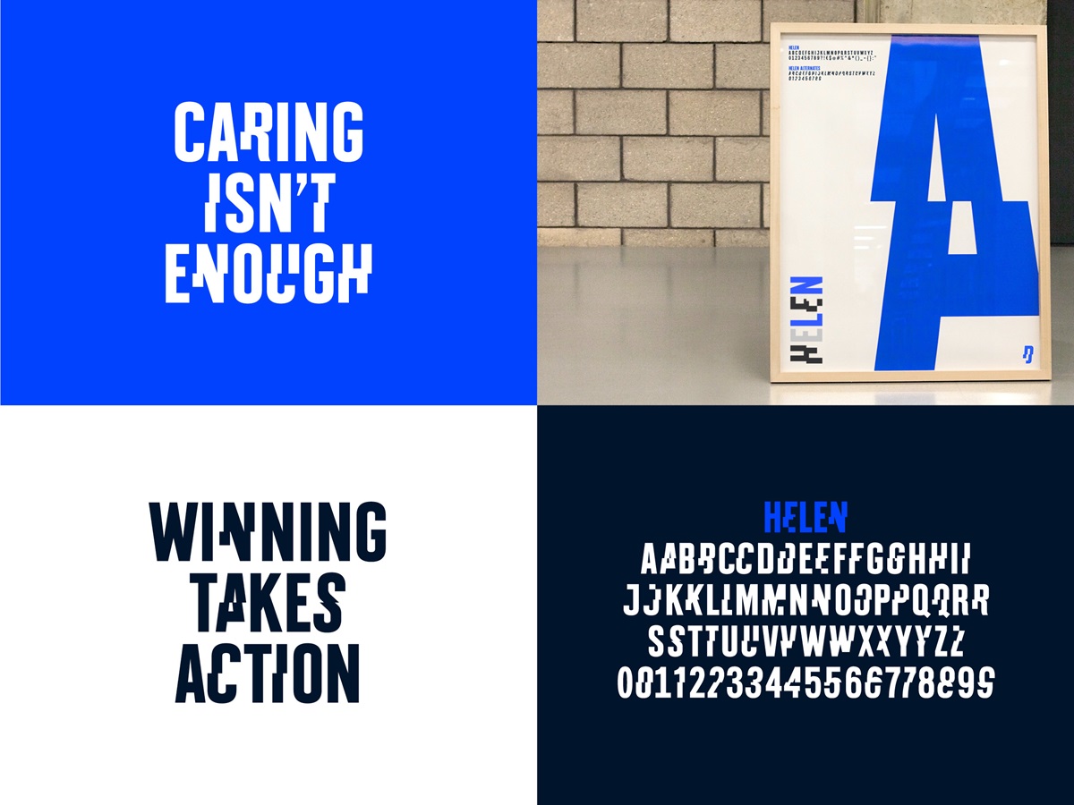
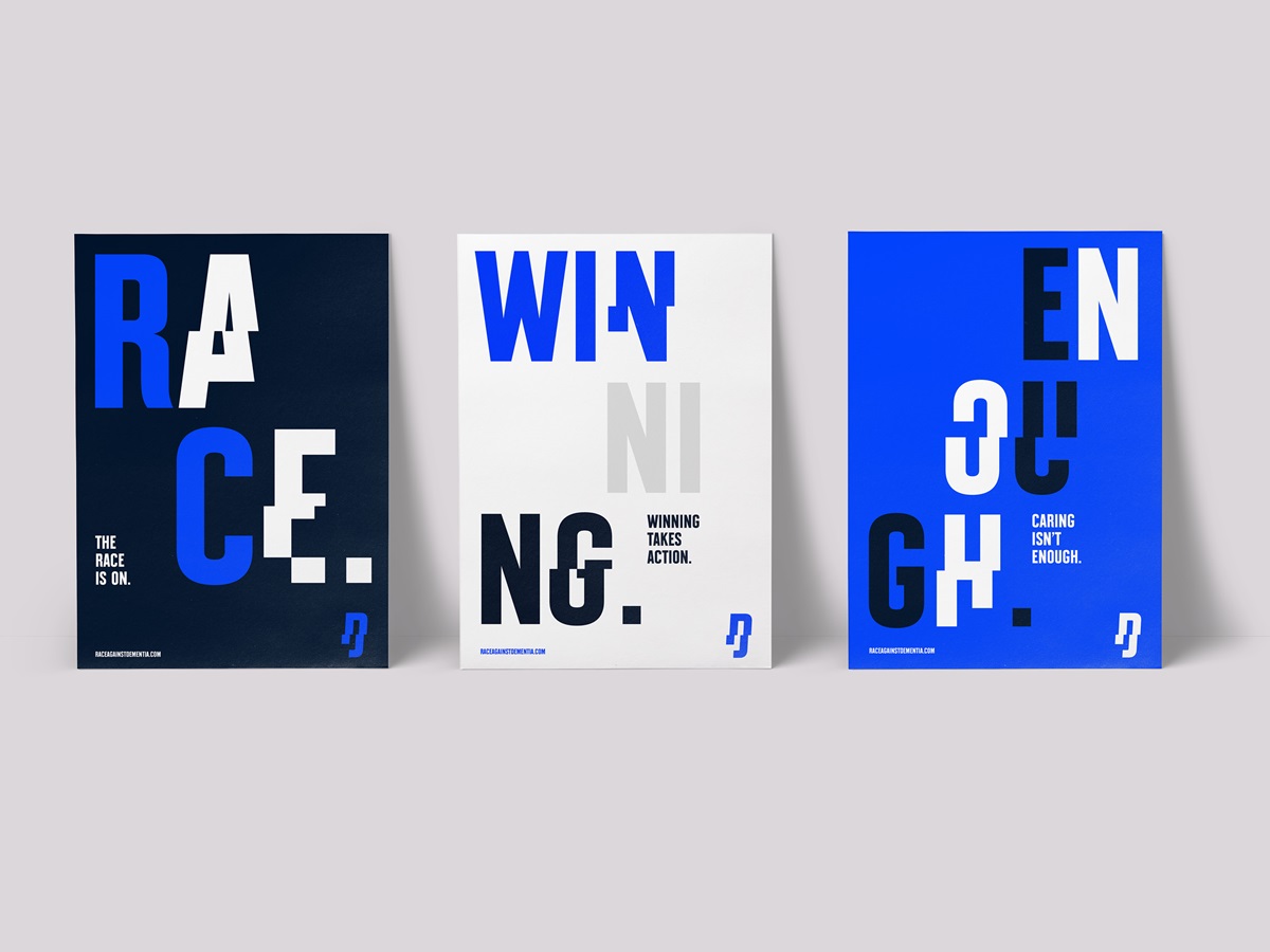
We split the type to represent the shattered mental state and also echo the fractured reality of Formula One driving.
Pantone 2175 - the vivid blue - was Sir Jackie’s racing colour in the great days of Ecurie Ecosse.
Agency Solution
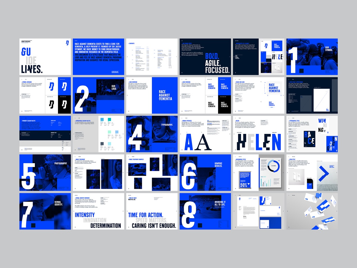
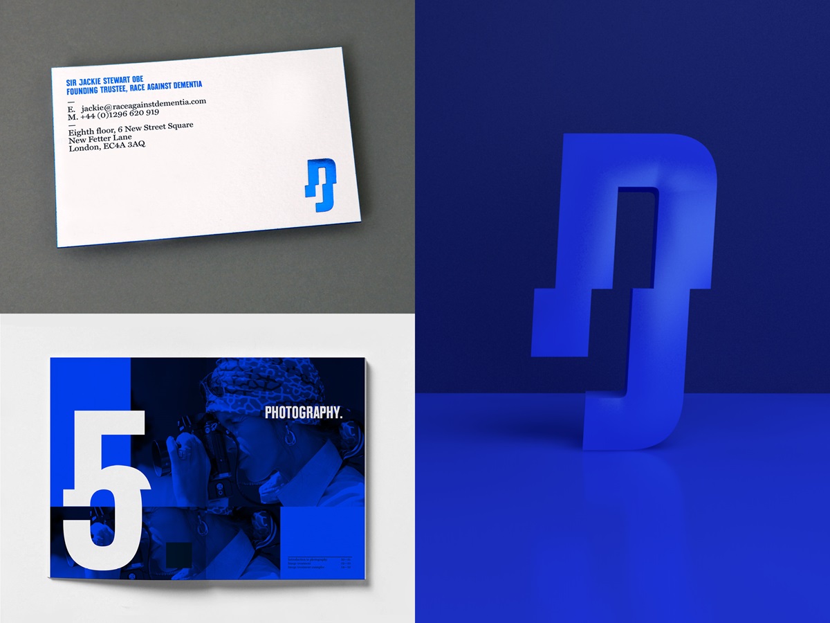
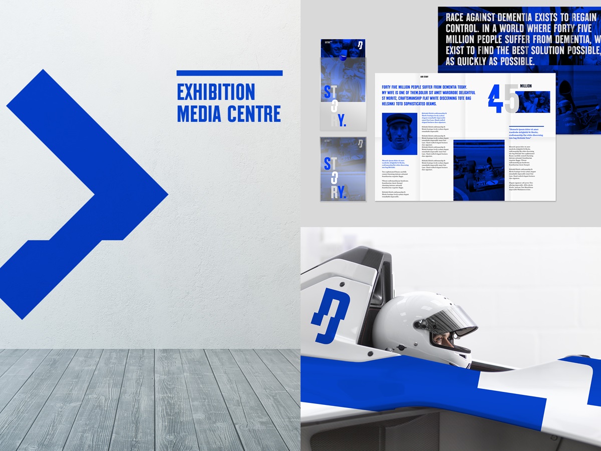
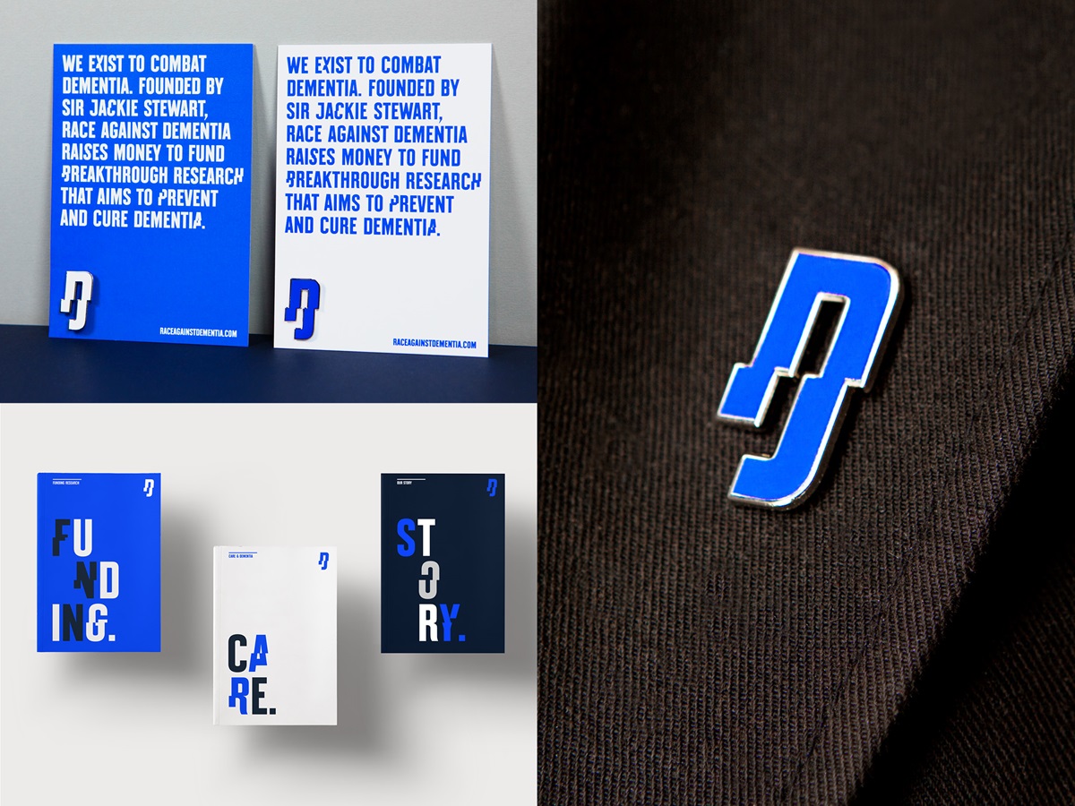
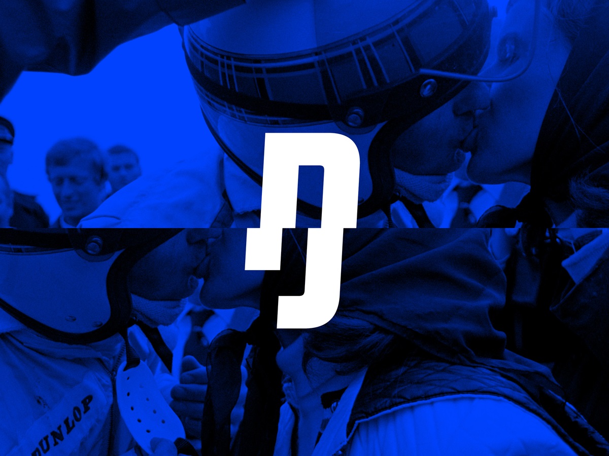
The new identity is distilled in the logo. We created an iconic marque with a deliberately distorted character, linking motorsport and dementia. This is based upon the concept of driving a racing car at high speed, which creates a disorienting and visually fractured landscape. People with dementia face a similar experience every day.
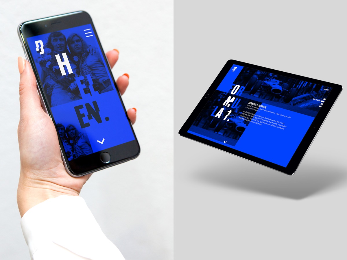
We also developed a bespoke display typeface, in partnership with Colophon Foundry, with distinctive visually fractured characters. We named the typeface ‘Helen’ after Sir Jackie’s wife.
The same fractured principle works for the photography, all of which comes from the extensive archive that catalogues Sir Jackie and Lady Helen’s lives.
Our colour palette also references Sir Jackie’s racing heritage, using the French Racing Blue of his iconic cars as a starting point.
We brought all these elements together across applications, including the microsite and print brochures, as well as the blue lapel badge.